“Shape Metaphors” at a Glance!: An Illustrated Guide to Understanding 120 Keiyu in Manga, by Takekuma Kentarô
Volume 24, Issue 3 (Translation 2 in 2024). First published in ejcjs on 13 December 2024.
Abstract
In the following translation of an important essay from seminal Manga Studies work How to Read Manga (Manga no yomikata, 1995), manga creator and editor Takekuma Kentarō examines the full range of manga iconography (manpu) and visual effects in this sweeping survey of over 120 concrete samples. He calls these “shape metaphors” (keiyu) and classifies them into two main branches: stand-alone icons and picture-dependent metaphorical effects. If a giant sweat mark has been drawn on the back of a character’s head, one can tell that he is in a panic just from seeing that back figure even though this image is unrealistic. This is a type of visual metaphor and the profundity of such expressions are distinct to comic books. Takekuma’s “shape metaphors” have such refined functions that express the situation or the state of mind of a character, often efficiently and even humorously. Through their use, comic book artists have been able to liberate their stories from the bare bones of plot and create additional layers of psychology and mood all through these seemingly nonsensical and excessive graphic marks. For the first time, this translation presents in English the writings of this seminal manga artist, humorist, critic, and scholar and provides an encyclopedic-like guide to some of manga’s most interesting and irrepressible visual tropes.
Keywords: Takekuma Kentarō, manga, visual metaphors, keiyu.
Translator's Introduction
In this translation, we present a seminal essay and a tour de force catalogue of manga icons (manpu) and visual shape metaphors (keiyu) containing such commonly found emanata expressions of water droplets, ropes, black spiral clouds, flower-laden backgrounds, and more. Takekuma Kentarō (1960- ) not only curates one of the most robust surveys of examples of manga icons, but he also describes their value for scholarship in the still nascent phase of Manga Studies in the 1990s. Both critic and a manga artist, he initially developed some of his terminology in his earlier and classic series Even a Monkey Can Draw Manga (Saru demo egakeru manga kyōshitsu; co-authored with Aihara Kōji, 1990-92), originally published from 1989 to 1991 in Big Comics Spirits.[1] Takekuma is among those so-called first-generation otaku (super fans) and, as a part of a circle of manga researchers that included scholars such as Natsume Fusanosuke, Takekuma made several important contributions to the equally classic How to Read Manga (Manga no yomikata, [Takarajima Sha: 1995]), from which the present translation originates.[2]
Takekuma and Natsume developed many of the major and fundamental ways of analysing basic manga elements, which are now collectively called manga hyōgenron (theories of manga expressions). The instant comparator for How to Read Manga in the West is Scott McCloud’s Understanding Comics (1993), of which Takekuma and Natsume only learned in the final editing phase of their book.[3] Whereas Natsume first formed his formal analysis method of parsing manga panels (like McCloud’s “Blood in the Gutter”) in How to Read Manga, Takekuma in the same book catalogued the commonly seen and well understood emanata of character psychology and movement, which were implicit but never before explicitly explained in such a rigorous way. As Ingulsrud and Allen write in their Reading Japan Cool (2009), this book is “arguably the most valuable book on understanding manga” and that, Natsume’s comparator text Why Is Manga So Interesting? “fall[s] short of replacing the analytical breadth” of How to Read Manga.[4] Using Takekuma’s article to build a table of “binary conceptualisation” of the denotations and connotations for “Drops of Liquids” (see Part One of this text), they use it to argue that “more effort” made to apply similar “structural categories may produce some results in understanding manga, but few symbols and categories can be organised as neatly” as theirs for drops of liquid.[5] With the present translation of this essay, Comics Studies scholars now have some of those basic tools and information to pursue further such analyses as Ingulsrud and Allen suggested. Until now, there have been no full translations of any of the How to Read Manga essays and chapters into English.
We might further understand manga language as a type of speech community (Hymes [1972], Gumperz & Hymes [1986], Labov [1972], Duranti & Goodwin [1992]), a group that shares values and follow particular stylistic choices that signal their community membership. Keiyu (“shape metaphors”) are an intrinsic part of this speech community, but like any speech community one needs to learn how to understand this feature of the language. In other words, anyone can recognise the shape of a water droplet, but what is it being used to signal within manga as a keiyu? That is something that is learned through experience. To speak frankly, this author (Karen Curtin) was at first befuddled at the thought that she could not understand manga icons without this type of keiyu primer. Indeed, she had forgotten the amount of time she spent using context cues to teach herself how to read keiyu. Such experience may perhaps be common for novice readers, which further indicates the idea that manga language is a speech community and, as with all speech communities, it requires some special study, training, or socialisation into the community fully to participate as a member.
Recently, more attention has turned to larger considerations of keiyu, manpu, and onomatopoeia,[6] but missing from scholarship in Comics Studies in English is a robust list describing these ubiquitous elements for Anglophone readers. For example, Wilde (2020) addresses the kind of modality (and mediality) of line and invented line in his consideration of manga,[7] but his readers would be greatly aided by this translation of Takekuma’s original essay, from which he quotes frequently. Similarly, Exner (2021) has focused on speech and sound balloons to articulate a genealogy of how ultimately 1920s American comic strips, like George McManus’ Bringing Up Father, were pivotal in influencing and stimulating the development of manga. “The history of contemporary narrative manga began in earnest,” he writes, when Japanese newspapers started to publish this “first fully audiovisual comic strip“ by McManus.[8] Those speech balloons (Jpn. fukidashi) are central to Exner’s argument, but he acknowledges all the “other inventive ways of making visual that which escapes direct apperception” and their development “still continues today, with Japanese artists having been some of the most prolific inventors of new transdiegetic signs,”[9] which is what Takekuma argued in the 1990s and is arguing in our translation of his essay with his careful breakdown of manga icons like speech balloons, puffs, smoke clouds, and more.
Takekuma’s organisational approach is, he insists, new in that he classifies manga icons and effects according to their shapes, rather than according to their meanings. He offers the explanation that there are many shapes, such as the water droplet, that can take various meanings, such as sweat or tears depending on context. Emerging from this focus on shape, Takekuma coins the term “shape metaphor” (keiyu), which is our direct translation of this neologism, to describe the enormous and myriad number of shapes employed by manga artists, and then follows these shape descriptions with a breakdown of meaning and not the other way around. In his description of “Japanese Visual Language” (JVL), Neil Cohn (2013) applies linguistic terminology to categorise these “visual metaphors” as “morphemes” that work at a kind of word level within a larger sentence utterance (of sequential panel flow). However, Cohn only samples a small number of them—his sixteen icons[10] can be found in Takekuma’s essay—but he lists them in service of presenting examples of JVL morphemes and, as Takekuma would say, therefore categorises according to meaning. Cohn spends much of the chapter on Japanese Visual Language pointing out various kinds of differences in meaning of these visual metaphors without detailing the connections and origins they share when they have the same shape, whereas Takekuma starts his analysis with the element of shape. Relying upon Shinohara and Matsunaka’s 2009 study, Cohn presents a “small sampling” of sixteen visual metaphors and he concludes, “…yet no studies have yet attempted to catalogue a ‘dictionary’ of these signs.”[11] Cohn’s point that there are no robust catalogues of visual metaphors only further necessitates the need to translate into English Takekuma’s ground-breaking survey of keiyu. Indeed, we would like to highlight the importance of Cohn’s work introducing a novel approach to understand JVL through the visual schema they employ, and, his creating a language-based model to understand manga symbols as visual morphemes. We argue that the pairing of Takekuma’s essay with Cohn’s discussion would only help Anglophone readers of manga better understand the “sociolinguistics” of Japanese culture better to enable them to overcome their own “biases [that] one’s own visual language create[s] towards the perceptions of other visual languages.”[12]
A point that seems not yet to have been made in the ongoing development and discussion of manga theory is that of low versus high context communication norms. Cultural communication norms may be separated as those that are low-context and those that are high-context (Hall 1976, 2000).[13] American communication is low-context, which means that American English-speakers will include a heavy amount of background and details for the listener. Japanese communication, on the other hand, is high-context and the interlocutors rely on each other’s understanding of the situation at hand, shared values, as well as non-verbal cues to convey meaning. The authors of this introduction are both specialists in Japanese language pedagogy and often witness how American learners of the Japanese language struggle with comprehension not due to missing vocabulary, but rather from lacking the ability to fill in the necessary information from the context for what was not said. We can expect that a visual language developed from a low-context culture and a high-context one will certainly have differences and perhaps this adds to an understanding of how and why keiyu developed so robustly for Japanese comics.
Here, Takekuma has separated keiyu into two distinct categories—manpu (manga iconography) and effects. Takekuma distinguishes manpu as those keiyu that can stand alone and still be read as having some meaning without background context. In fact, in Even a Monkey Can Draw Manga, Takekuma and Aihara were entirely unconcerned with drawing techniques except to point out that manpu (a term they already employed at this point) are key to expressing “sensation and emotions” and that they “are only meant for manga.”[14] Effects, on the other hand, are keiyu that are completely unclear in meaning without some other context, as in the case of parallel lines. We would like further to note that effects seem to be a type of keiyu that may permeate or even take up the entire background of the panel whereas manpu tend to be added to the drawing on top of a character (or sometimes even an item). This can be tied into perhaps the tendency for Japanese comics to have less “Macro” (Cohn’s term for larger shots full of detailed background) panels than American ones as was pointed out by McCloud and later confirmed by Cohn.[15] If panels are not hindered by the need for details, then it leaves more opportunity to utilise effects. Furthermore, the arguments as to why manga developed to have less “Macro” shots include practical reasons as well as cultural ones, but current discussions have yet to mention that in a culture in which high context communication is the norm, receivers of the message (as Hall would put it) is expected to bring in their understanding of the context and apply it to “fill in the blank,” as it were.
In Takekuma’s article, he opens by giving an example of a few panels from the manga A ♡ KISS for My Kitten and asks the question: how can such enormous meaning of the characters’ emotions, thoughts, and even what is happening in the background be conveyed so well despite having just blank white space and no discernable action or detail in the background? Takekuma’s answer is keiyu. We would like to add that it is also the ability of the reader to understand the high-context nature of manga, and to have the background contextual knowledge to “fill in the blank” with the right cues. We hope that this translation will better equip Anglophone readers more fully to understand the rich context of Japanese manga expressions.
Finally, the translators thank Takekuma-sensei for his permission to translate and publish his essay into English. We also extend our thanks to Professor Jon Holt of Portland State University for his help in reviewing our translation, but the responsibility for any errors or inaccuracies is entirely ours.
—•—
“Shape Metaphors” at a Glance!:
An Illustrated Guide to Understanding 120 Keiyu in Manga
The Reason Old Man Yukichi is Unduly Angry
First, please look at Figure 0.1 below. Everyone knows that it is Fukuzawa Yukichi[16] of the 10,000-yen bill, but something is off. Doesn’t it look somehow like he is displeased and perhaps a bit angry?
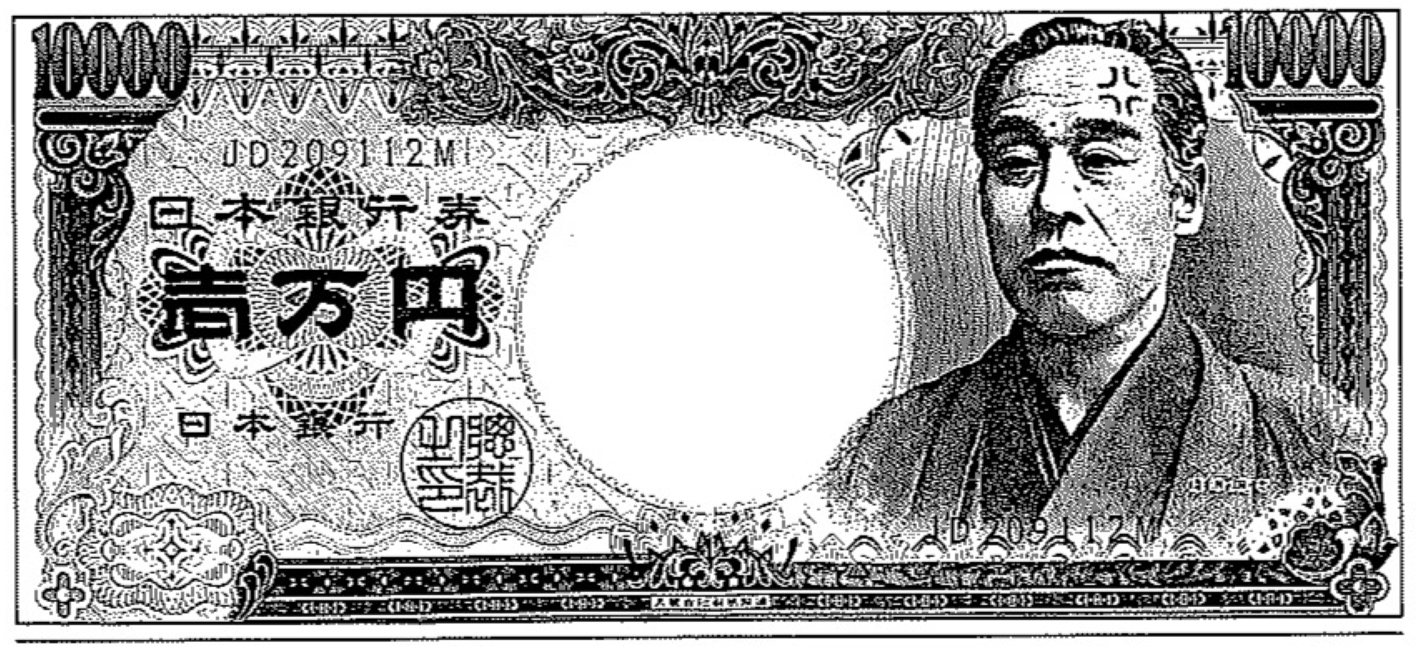
Figure 0.1. Huh? What’s going on with Fukuzawa Yukichi on the 10,000-yen bill…? This is Fukuzawa Yukichi, the man himself, on a 10,000-yen bill that anyone might see on a daily basis. It seems like he’s pretty angry, but is that just your imagination? (Sorry for the shameless way I am setting this up…)
Of course, this is a trick by the illustrator, yours truly. Those temper veins you can see on his temple are things the illustrator added on purpose. Just so you know: this is just something I drew on a black and white copy of the bill. I am not counterfeiting money.
Let me get back to my point. I call these things that are specific to manga “shape metaphors” (keiyu 形喩) because one can only describe them as “symbolic expressions that are neither words nor pictures.”[17] For a detailed definition, please refer to Natsume Fusanosuke’s essay, “My Attempt to Categorise Manga-Like Symbols” later in this book (Manga no yomikata, pp. 112-115).
Let me get back to my point. I call these things that are specific to manga “shape metaphors” (keiyu) because one can only describe them as “symbolic expressions that are neither words nor pictures.” Why is it that manga gives us such expressions like these shape metaphors? Most likely it is because shape metaphors make it possible to communicate nuance in an efficient manner. For example, if one wanted to show a character crying, in your average manga an artist could just draw a water droplet shape metaphor (a tear) under the eyes. With that mark alone, any reader would instantly understand that the character is crying.
Whether or not one fully appreciates a manga illustration as art is a completely separate issue. This is because, above all else, manga has to get the story across to the reader smoothly. For that reason, in manga we must first and foremost have “illustrations that get across the meaning clearly.” In terms of its communicative effectiveness, shape metaphors truly are amazing inventions, aren’t they?
Shockingly Effective! Shape Metaphors Convey So Much Meaning
As shape metaphors developed in postwar manga, eventually we ended up with artists like the one who drew the comic panels below in Figure 0.2. You will probably see this if you look closely at it, but on this comic page there is nothing we can call a background at all. Despite the lack of background, the amount of information and the sheer communicative effectiveness packed into this one panel are shocking. For example, just by looking at the central panel, one can detect the presence of a third party even though he is not drawn here.
We know all this information about the third party in Figure 0.2 from the presence of the focus lines drawn in the behind the boy. Focus lines are a shape metaphor that draw one’s attention to one point, or they show energy emitting out to another point. Here we see focus lines coming from behind the boy, so we know that the owner of the voice is behind him. Moreover, that person in the back is quite angry. The blood veins inlaid all throughout that area provide evidence of that anger. Here, the bulging blood vessels are detached from the literal meaning of “vein deformities” and purely function as shape metaphors to show “anger.”
On top of all this information being conveyed from behind the characters, we can see that the little girl is loudly crying from the large number of water droplets bursting forth from the top of her head; we also understand that the boy is experiencing both confusion and turbulent inner thoughts as indicated by things like the water droplets on the boy’s cheek and the spiraling hair flying from his head. I will give a detailed explanation of these shape metaphors in the following section.
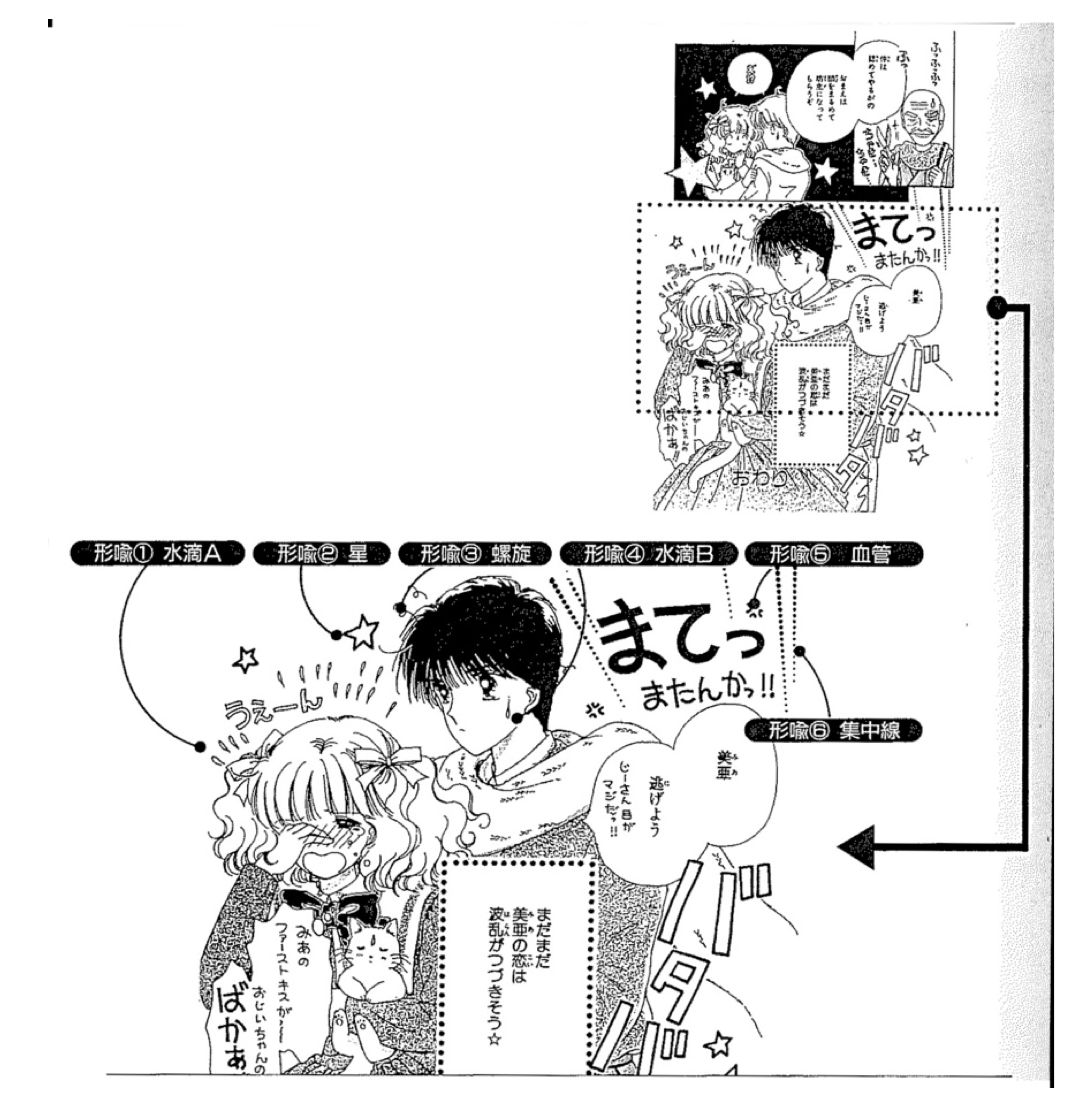
Figure 0.2. “It’s like a display case for shape metaphors!” This is one page from the shōjo (girls’) manga A♡ KISS for My Kitten (Koneko ni KISS♡). I have taken a part of the scene from the page and blown it up for closer examination. In this enlarged part of the picture, there is nothing that seems like a background. However, for anyone used to reading manga, even with the blank background, the reader can probably extract a great deal of information from this scene. What conveys all that information are the “shape metaphors” or symbolic expressions unique to manga and inlaid all around the two characters. The five types of shape metaphors on display here are all just basic shapes, but I want to focus on the fact that even though they look simplistic, there are actually different meanings for “Water Droplet A” (tears) and “Water Droplet B” (sweat) being imparted. In any manga, unconscious complex mental processes will be at work in the panel backgrounds. (Kusanagi Ryūju, A ♡ KISS for My Kitten [Koneko ni KISS ♡ , 1993] originally published in Puchikko [Very Tiny] magazine.)
Text in illustration of Figure 0.2 presented from right to left:
(Top two panels: Panel 1 top right)
Old Man: “Heh heh heh!” “Hah, for your relationship to be approved…” snip! snip! (sound effect from scissors)
(Top two panels: Panel 2 top left)
Old Man: “…Your head must become bald and round, like a monk’s.”
Girl: “Huh?!”
(Bottom enlarged panel)
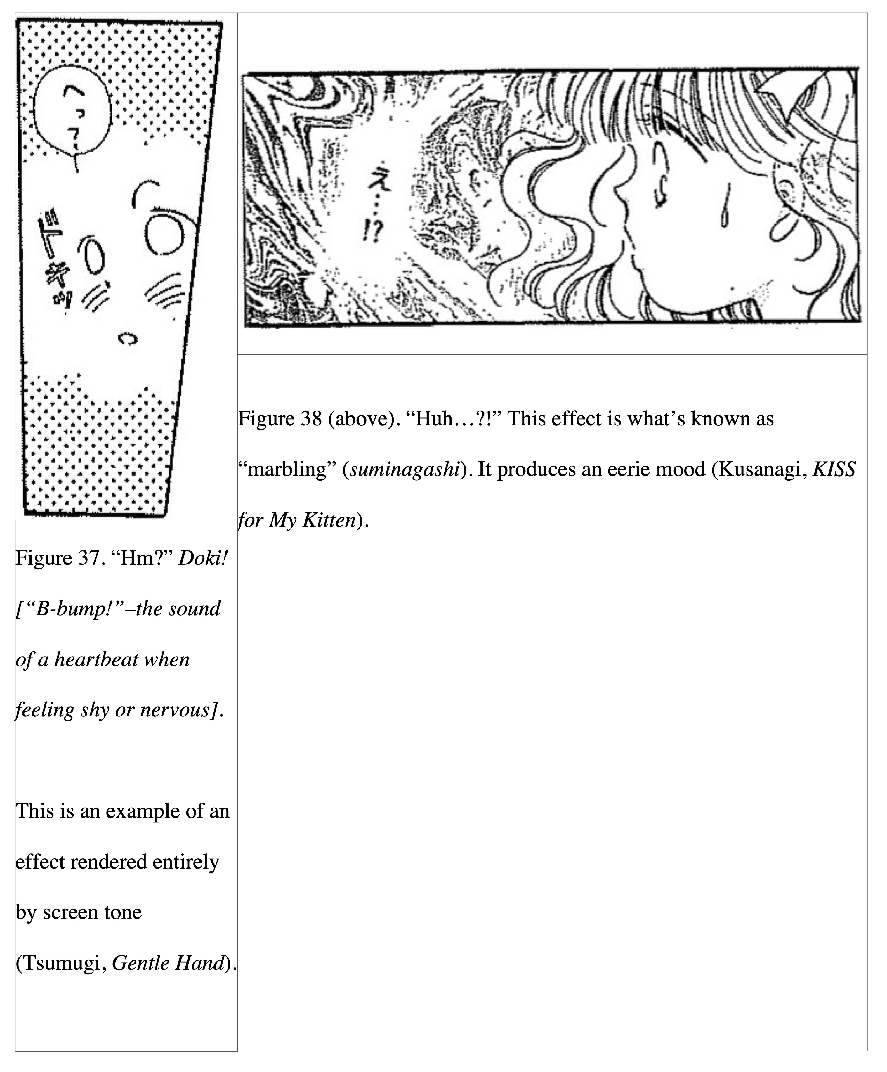
Words floating behind the boy from Old Man: “Wait! Wait, I said!!”
To the right of the boy: “bata bata” (the sound effect of him running away)
Boy: “Mia, let’s get out of here! That old man has a serious look in his eye!!”
Words floating above Girl: “Waah!”
Girl: “My first kiss! …stupid, stupid old man!”
Inside box with narration: Mia’s love troubles look like they will continue ☆
(Text over the top of the girl’s skirt only visible in top full panels: The End.)
(Top list of keiyu)
Keiyu 1: Water droplet A tears
Keiyu 2: Starry idea
Keiyu 3: Curlicue lines of confusion
Keiyu 4: Water droplet B sweat
Keiyu 5: Anger veins
Keiyu 6: Dotted focus lines
Analysing through Shape Instead of Meaning
The charts shown in Tables 1 and 2 are my attempt at categorising a few representative shape metaphors (keiyu). I must point out that, of course, this is not the entirety of shape metaphors nor is it a perfect categorisation.
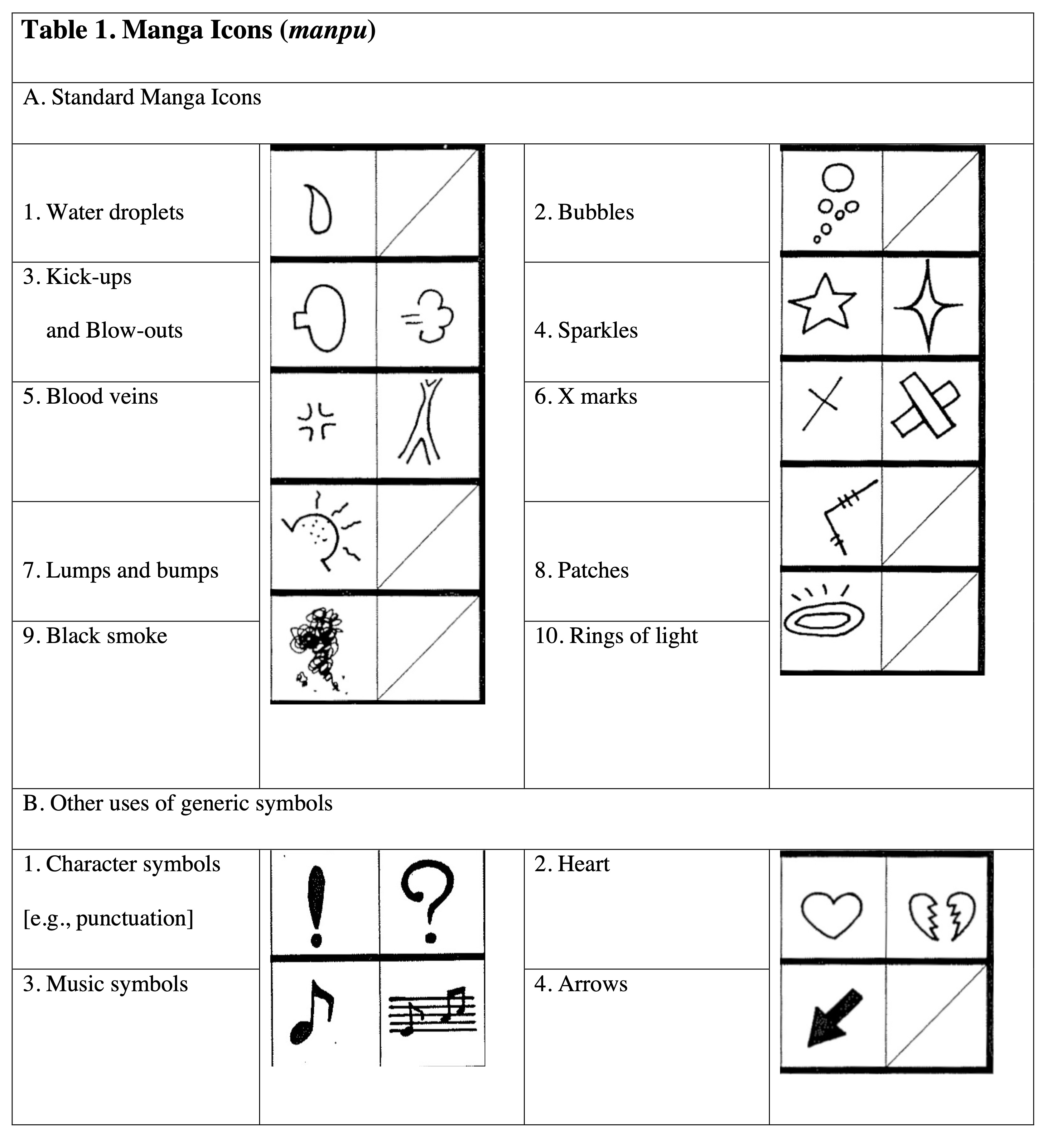
Often in manga primers, we see shape metaphors categorised according to their meaning. When these books introduce the characteristics specific to manga’s symbolic expressions, they present shape metaphors under topics like “various marks for anger” and “various marks for speed lines.” Instead, I decided to adopt a categorisation-by-shape approach here because, although categorisation-by-meaning is practical and can be easy to understand, if you just try to categorise that way, then you will run into some trouble. For example, shape metaphors such as “tears” and “sweat” have different meanings, but their shapes are exactly the same. In other words, with the categorisation-by-meaning approach, multiple items may have the same shape and it is liable to cause confusion.
This problem of categorisation is the same for words. The word “dog” originally means “mammal belonging to the carnivorous canine family,” but it can also connote “minion of a powerful entity” in Japanese, for example. Thus, we can similarly understand how the meaning of shape metaphors changes according to the context in which they are used. That is why I decided to create the large category of “water droplet” for my analysis that then allows me to explain things like “sweat” or “tears” as practical examples of the same shape metaphor. By categorising by shape, one can show the true function of shape metaphors.
Somewhere between Manga Iconography and Their Effects
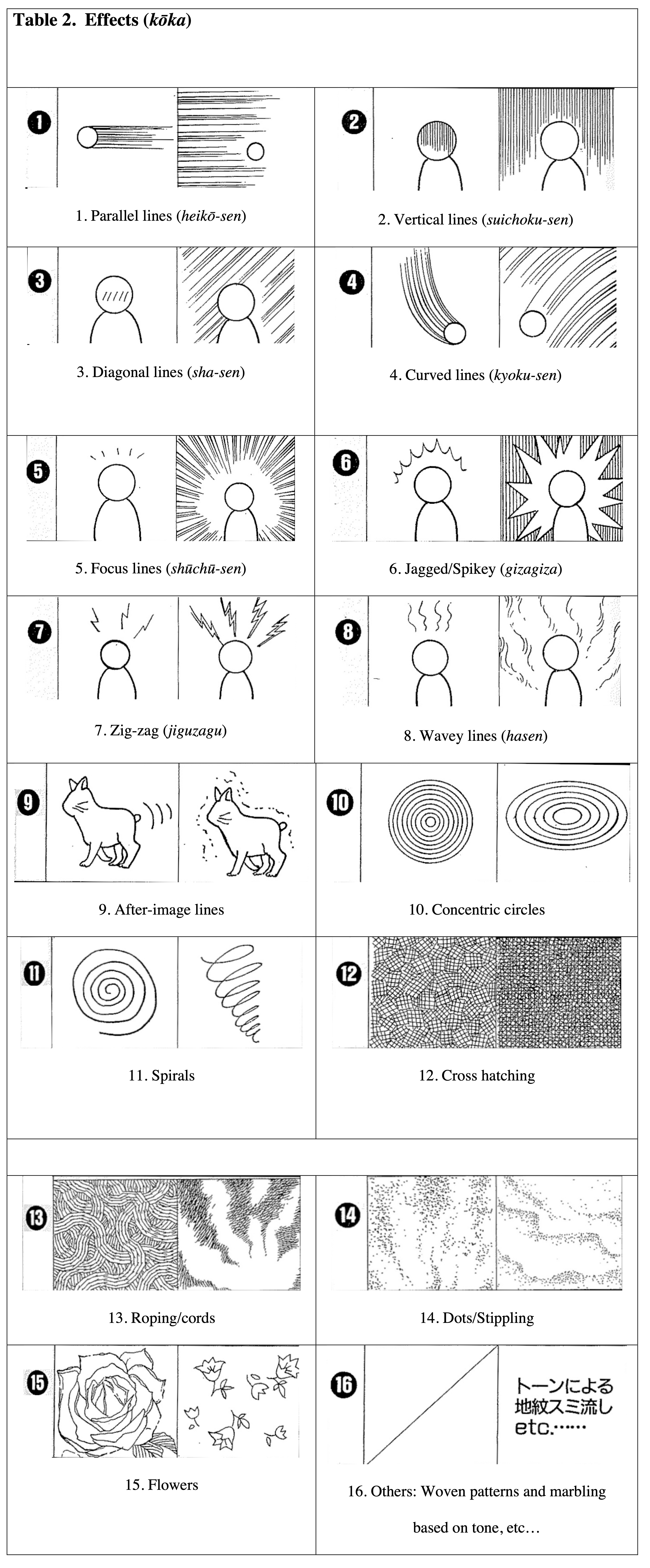
By the way, you may have noticed, but I have already been separating shape metaphors into “manga icons” and their “effects” here. That is because it seemed to me that “water droplets (sweat, etc.)” and “parallel lines (speed lines, etc.),” for example, have properties that are very different as shape metaphors. Certainly, one could describe them both similarly as “symbolic expressions that are neither pictures nor writing,” but there is a clear difference if one compares these two shape metaphors. In the case of a “water droplet,” anyone can understand what it is even with just a single drop drawn; whereas in the case of “parallel lines,” they really are meaningless when those lines appear alone.
For shape metaphors like “parallel lines,” only once other illustrations are put into the panel can one for the first time ascertain whether they are “lines that show movement” or “lines that show a dimly-lit space”. Consequently, it is almost impossible to have “parallel lines” drawn without other illustrations present (although there are exceptions to this). Hence, I decided to distinguish the two kinds of shape metaphors. I treated those shape metaphors that to some degree make sense even when they appear alone as “manga iconography,” and I used the label “effects” for those shape metaphors that are meaningless by themselves and almost never used alone.
I will repeat myself, but this categorisation is not comprehensive. The reason why is that there are many examples of borderline cases for shape metaphors. For example, in a context such as when extremely small focus lines are drawn a bit above the head of a character to show a “realisation.” In the aforementioned type of context, I would categorise the focus lines into “effect,” but it might also be okay to say they are mostly “manga iconography.” Well, if you think about it too much then there’s a risk you’ll get caught up in the categorisation game, so let’s just stop here with what we have.
Once You Change Its Location, Its Meaning Also Changes
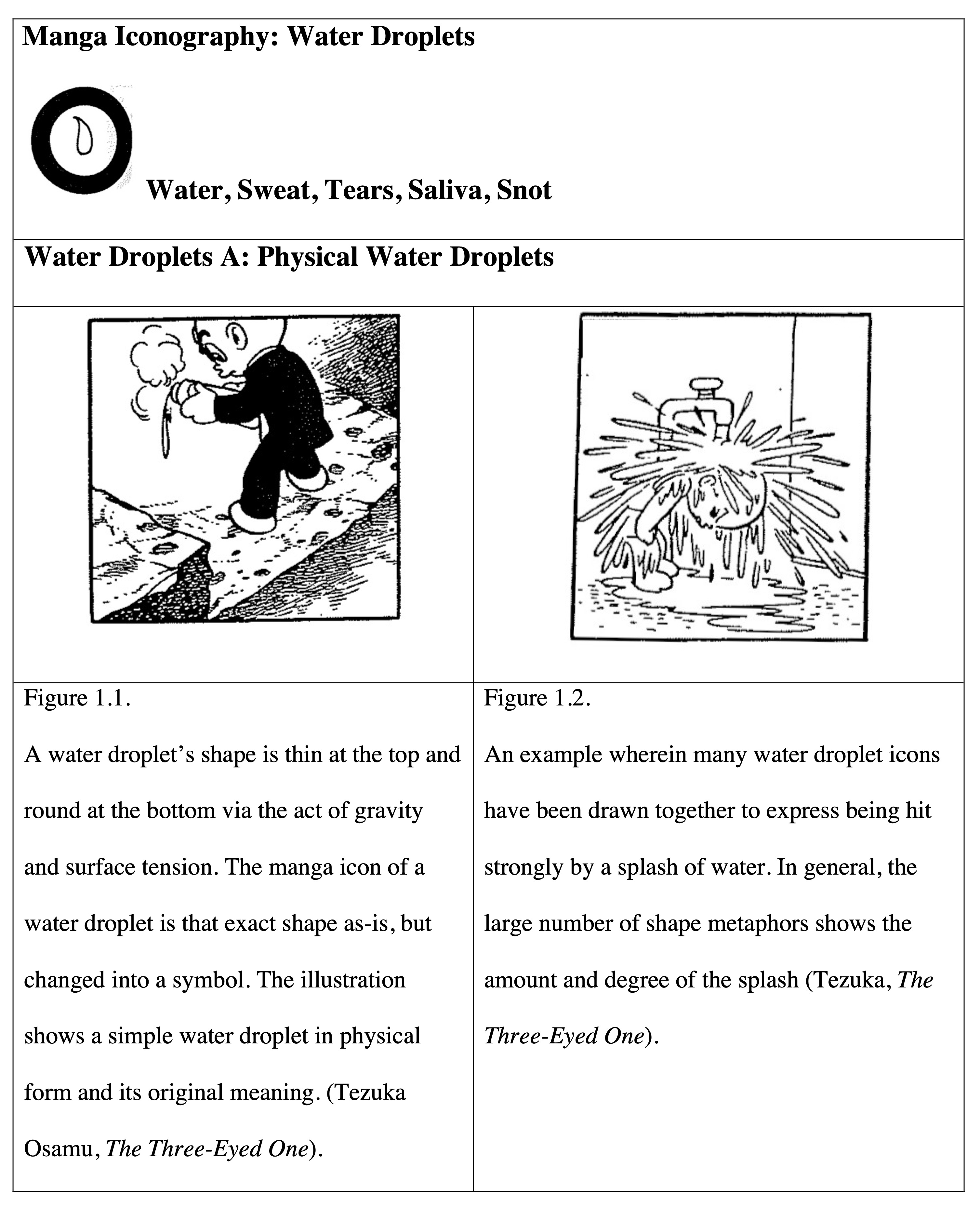
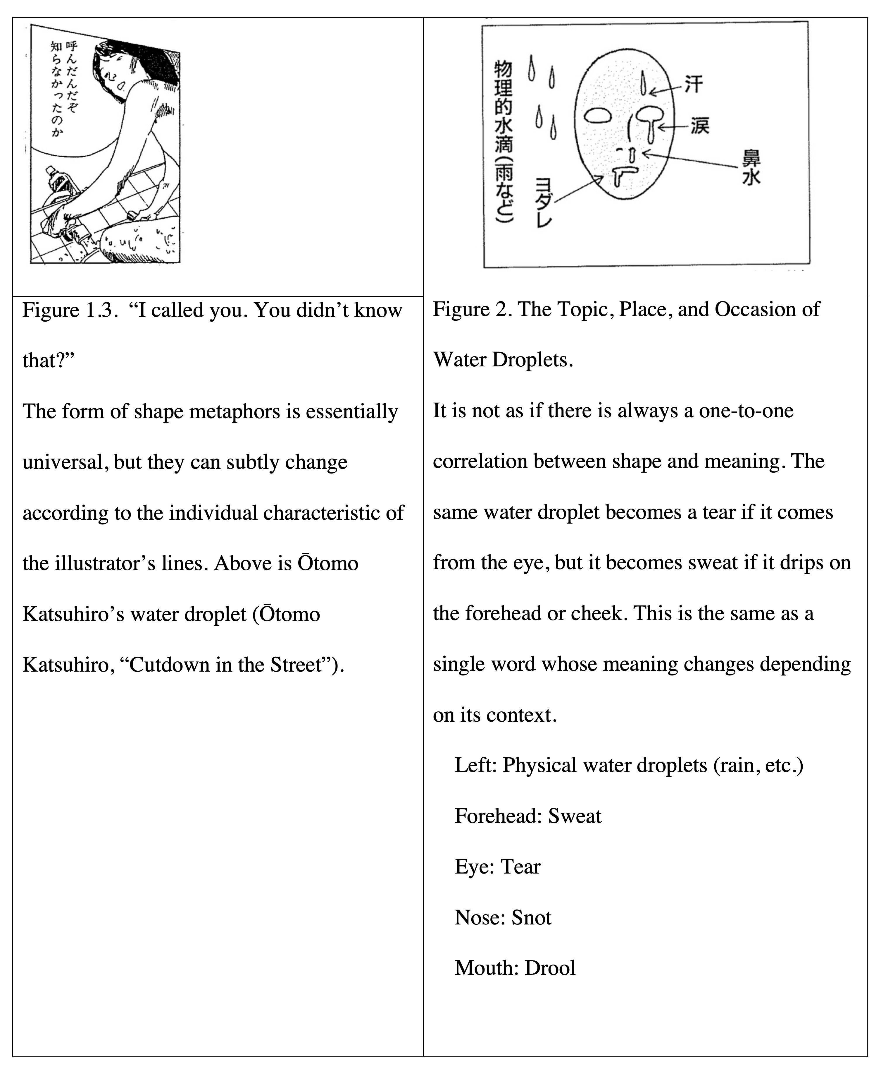
There are a great number of shape metaphors for which the meaning of a psychological state overlaps with the symbol’s original meaning of a physical shape. Water droplets, too, were at first nothing more than a pragmatic symbol to show drops spilling forth. Even now artists still frequently use this original meaning of water droplets (Figures 1.1-1.3).[18]
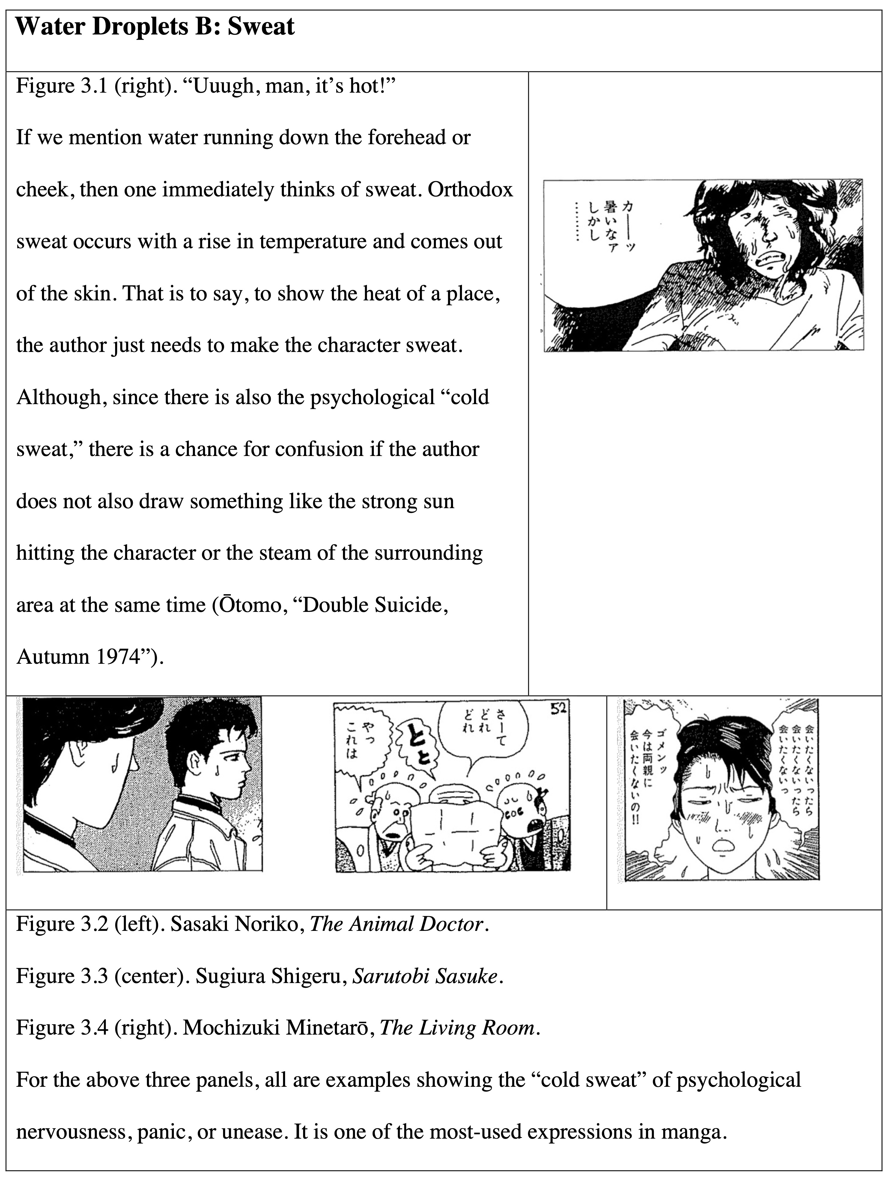
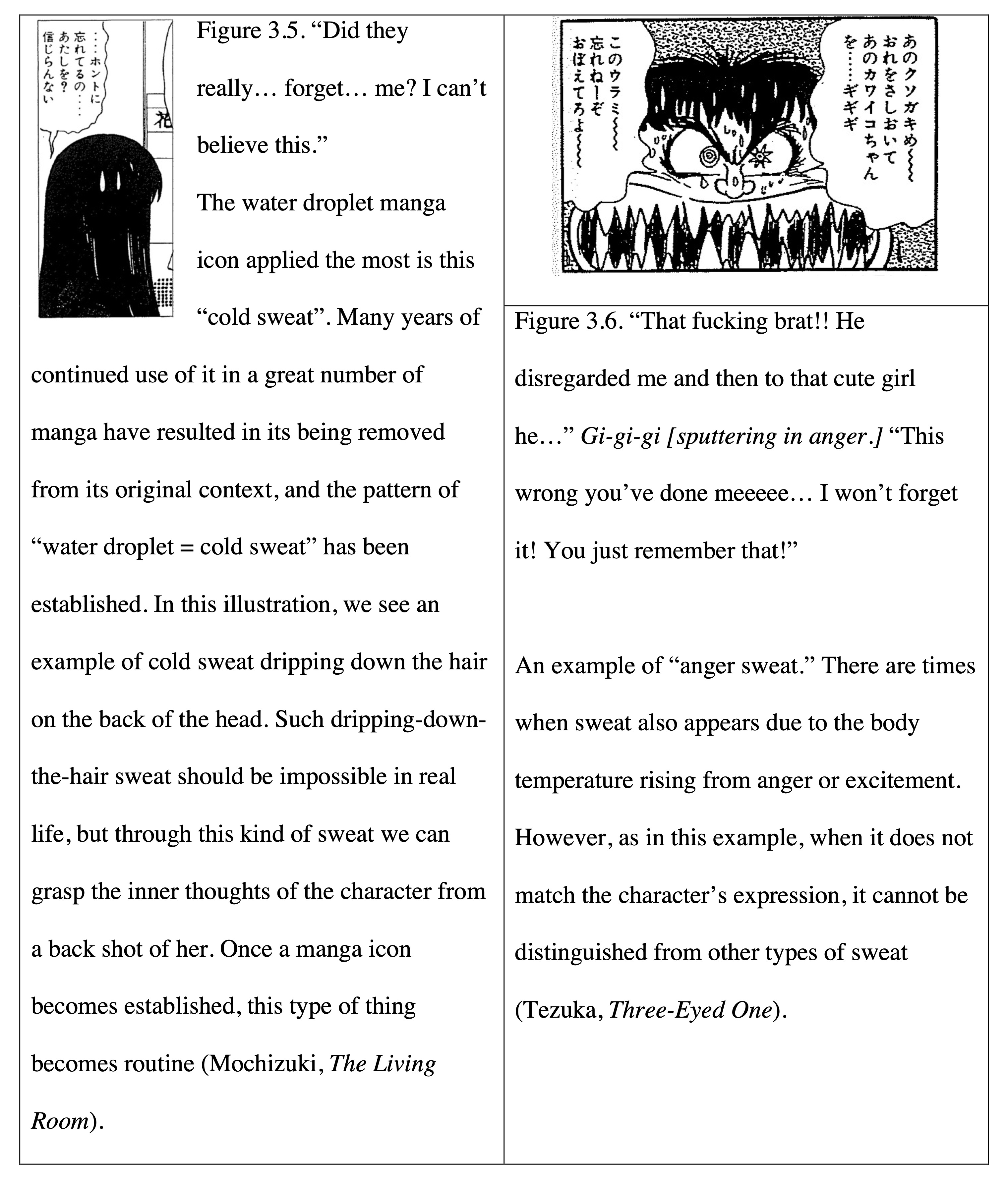
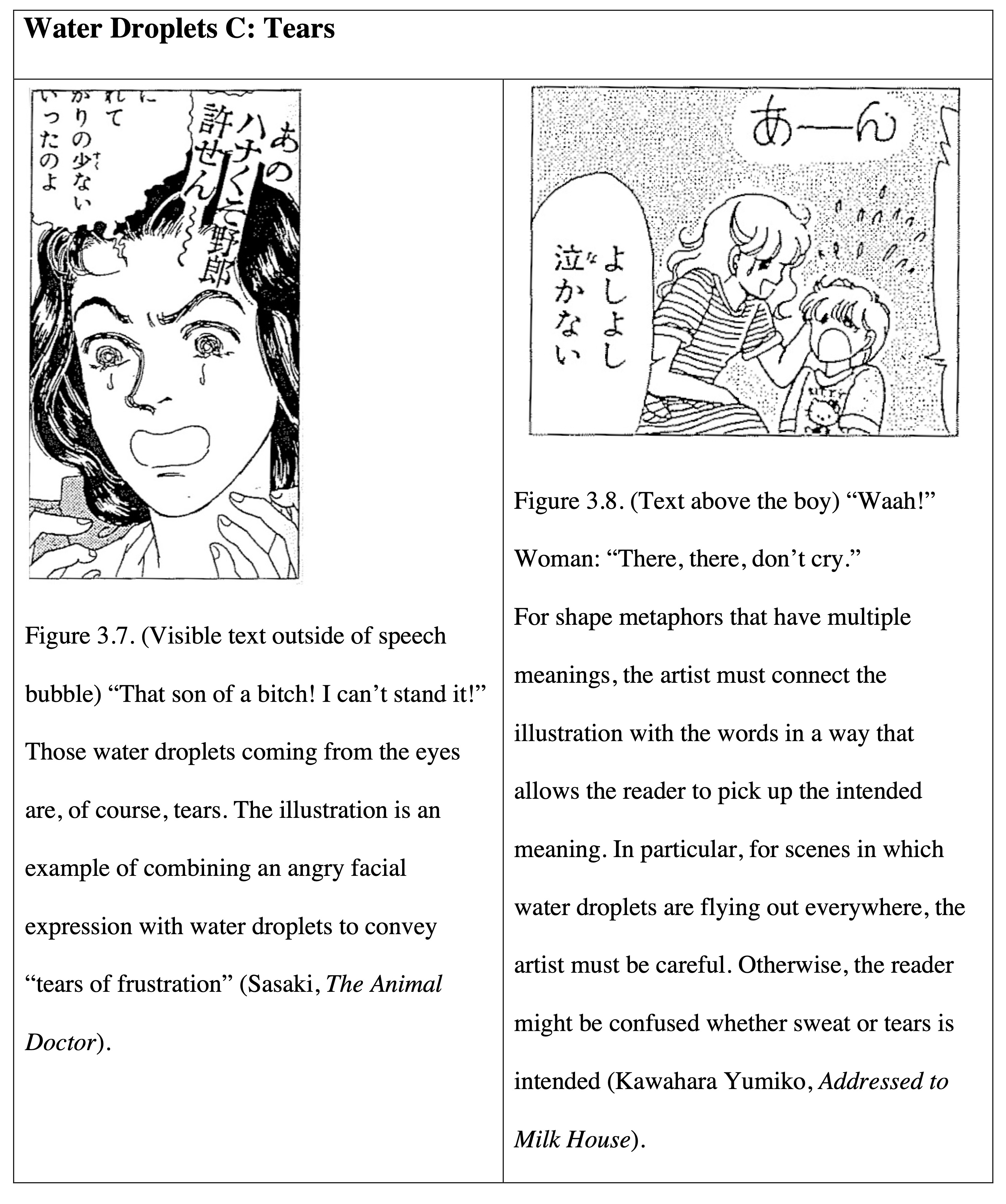
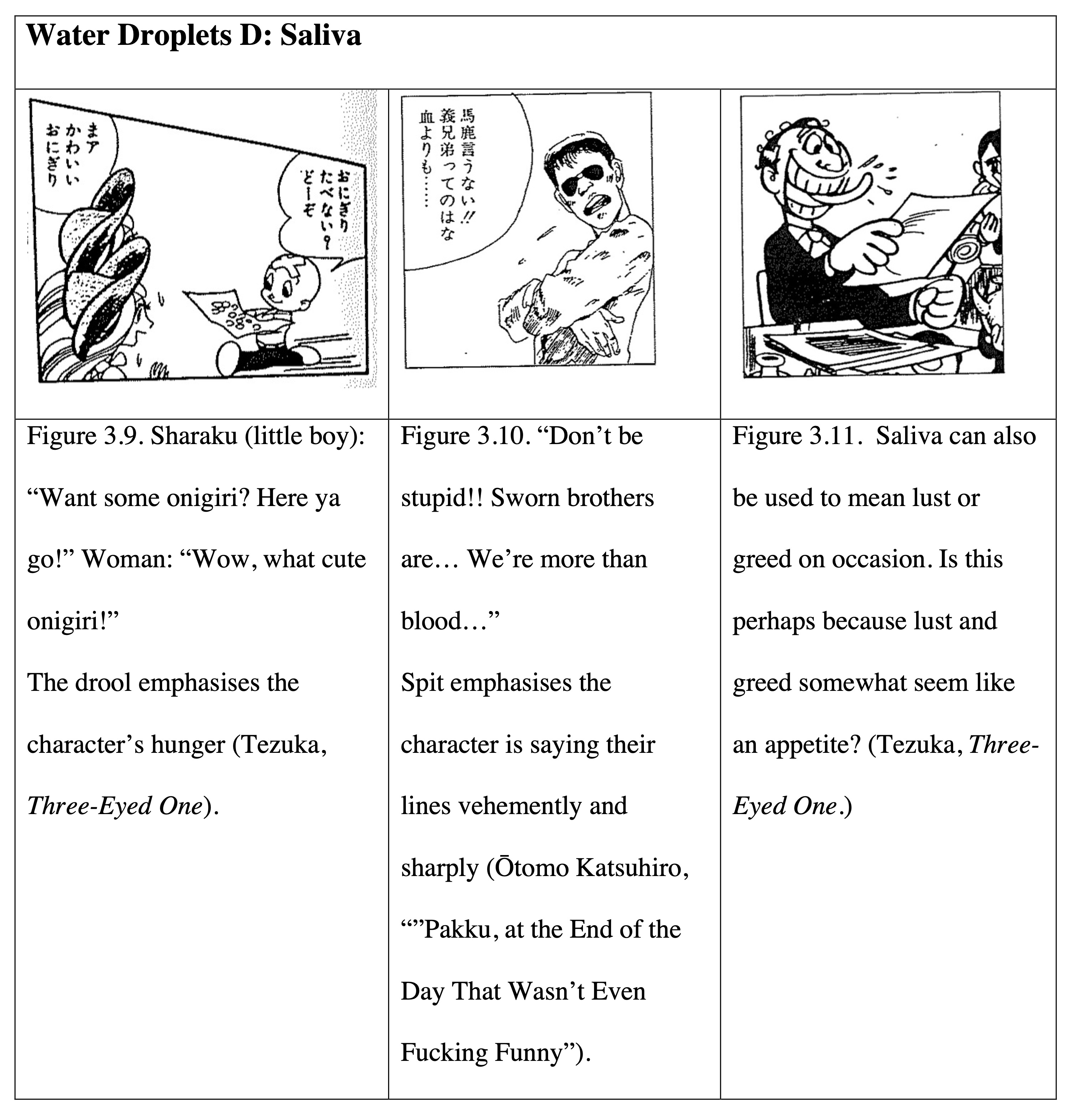
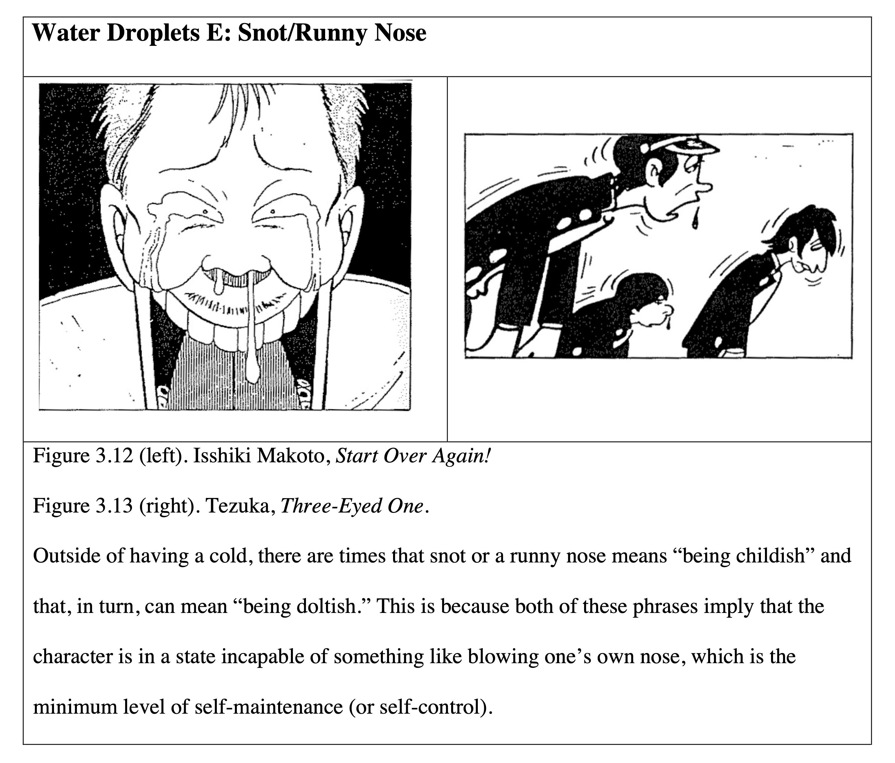
Water droplets may be employed to express bodily fluids such as sweat, tears, and the like, but they also came largely to take on psychological meanings. For example, sweat has both a physiological type and a psychological type. The former is sweat that beads up in order to regulate our body temperature when it gets high (Figure 3.1); the latter appears at times such as when something strongly affects one psychologically. This type of sweat has nothing to do with the temperature, so it is usually called “cold sweat” (Figures 3.2-3.5).
Even among all the countless manga icons, there are probably none that are as handy as water droplets for showing a character’s psychological state. Outside of sweat, water droplets can be used in any way the artist sees fit for tears, drool, and the like, and, they produce psychological nuances in the comic’s panels (Figure 2).
An Illustrated Guide to Manga Iconography
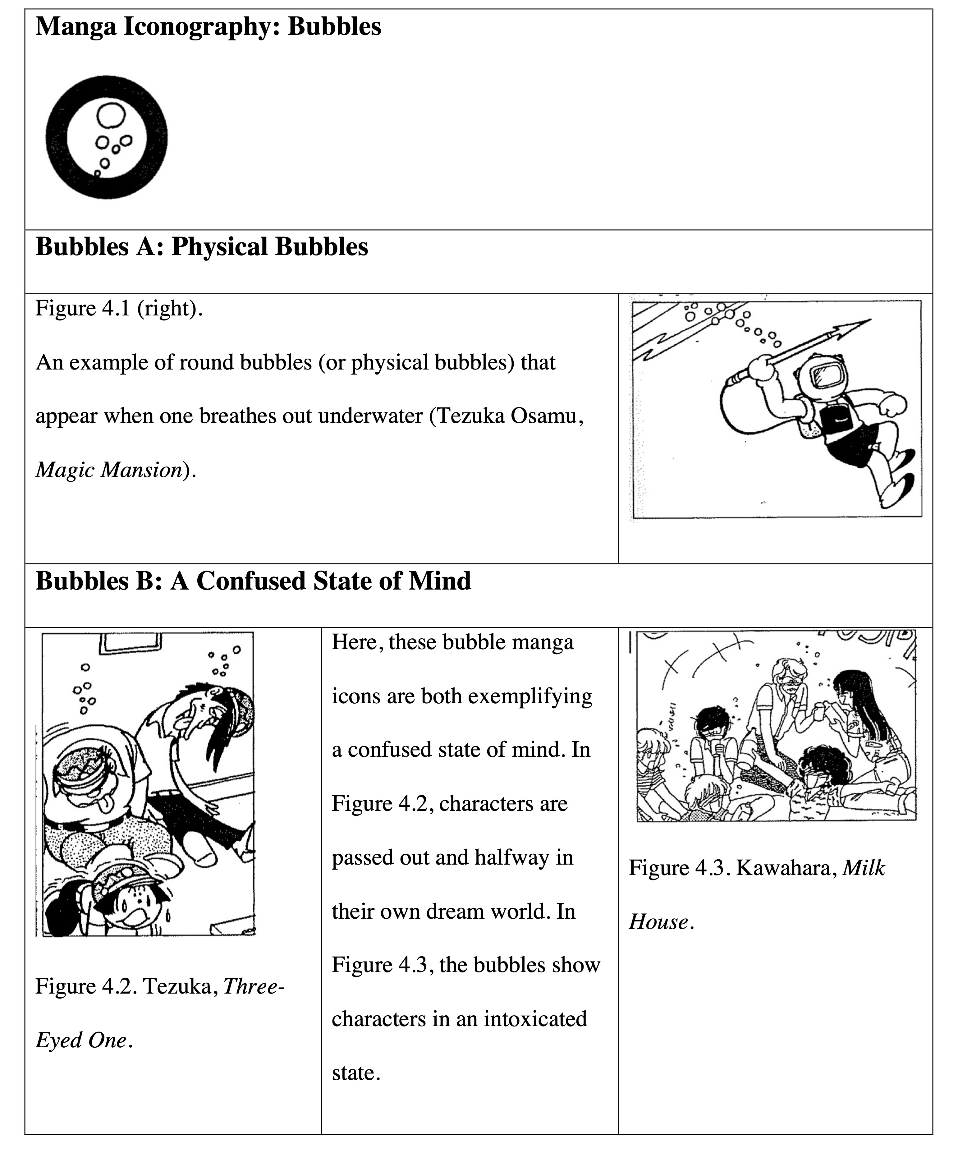
Visualising Consciousness via “Bubbles”
In Figure 4.1, we see these quintessential bubbles that pop out when one exhales underwater. If this were happening in the air, it would be mucus or phlegm (i.e., drool or snot) coming out from the body while breathing. This mucus becomes a round air bubble due to the surface tension and drifts through the air akin to light soap bubbles, becoming what is commonly called “blowing bubbles” (awa wo fuku).
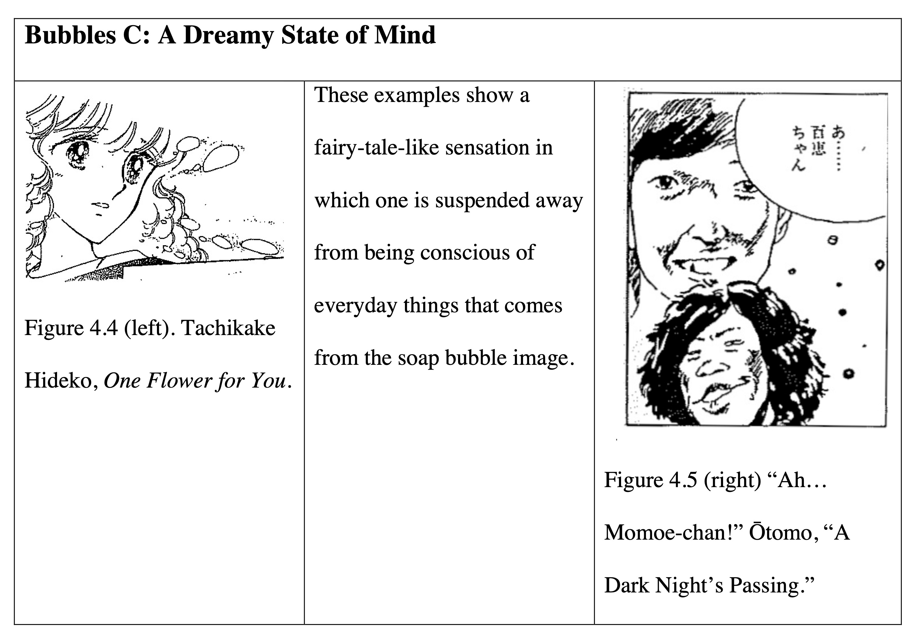
In general, there are probably not many times when one “blows bubbles” as a normal state of consciousness. That is to say, they appear in manga during situations such as being drunk or losing consciousness, like when people have little control over their breathing or secretion of mucus. In other words, in cases where bubbles are used as manga icons (Figures 4.2 and 4.3), it means the character is confused or there is a decline in mental awareness. I think this is another excellent example of a physical symbol being transformed into a psychological symbol. Aside from this, in Figures 4.4 and 4.5, we see the frequently used bubble manga icon here twice showing a fairy-tale-like “dreamy state of mind” from the images of those soap bubbles floating through the sky.
Classic Manga Icons That Visualise Actions
Next, we have a type manga icon that has a long history. Tagawa Suihō ’s frequent use of visualised actions in Norakuro (Black Stray) was already famous before World War II, but it is likely that such manga icons were invented much before then. We can separate into two groups those shapes that represent small wisps of smoke, which are illustrations that look like several short arcs in the air, and those shapes that look like ovals with tails. However, both of these shapes convey that something has occurred and the air has moved due to some kind of force. In short, both are visualisations of dust and steam.
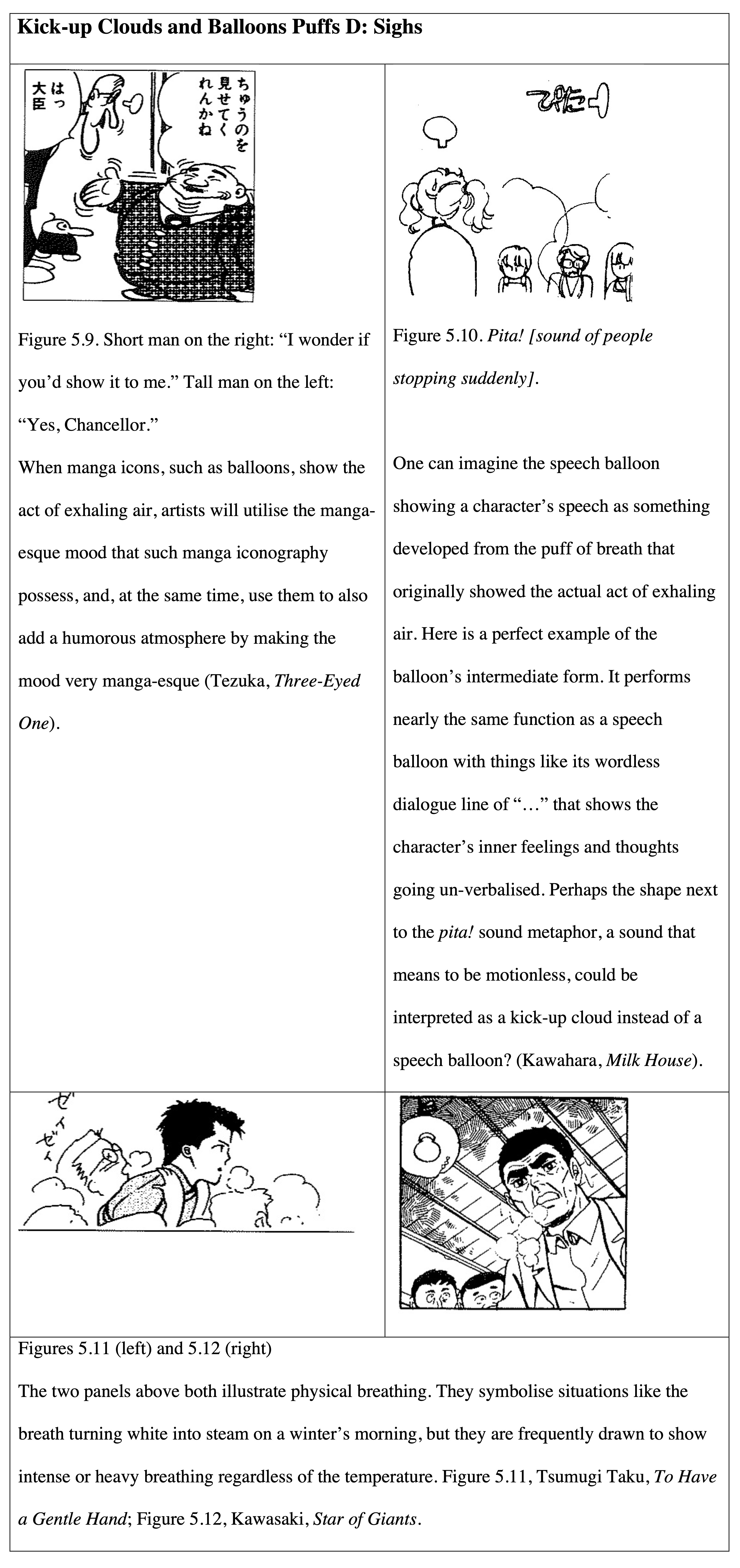
Normally, one cannot see air with the naked eye, but we can just barely sense the air visually from things like one’s breath turning white on a cold day or the dust produced when one kicks dry ground (Figure 5.1).[19] Those puffs that draw your focus to air have now become symbols as manga icons. While there are no universally used names, these two icons are frequently called “kick-ups” for dust and “balloon puffs” for breathing out. The “speech balloon” (fukidashi, [i.e., a puff with dialogue in it]) should be considered something that has developed from the latter icon.
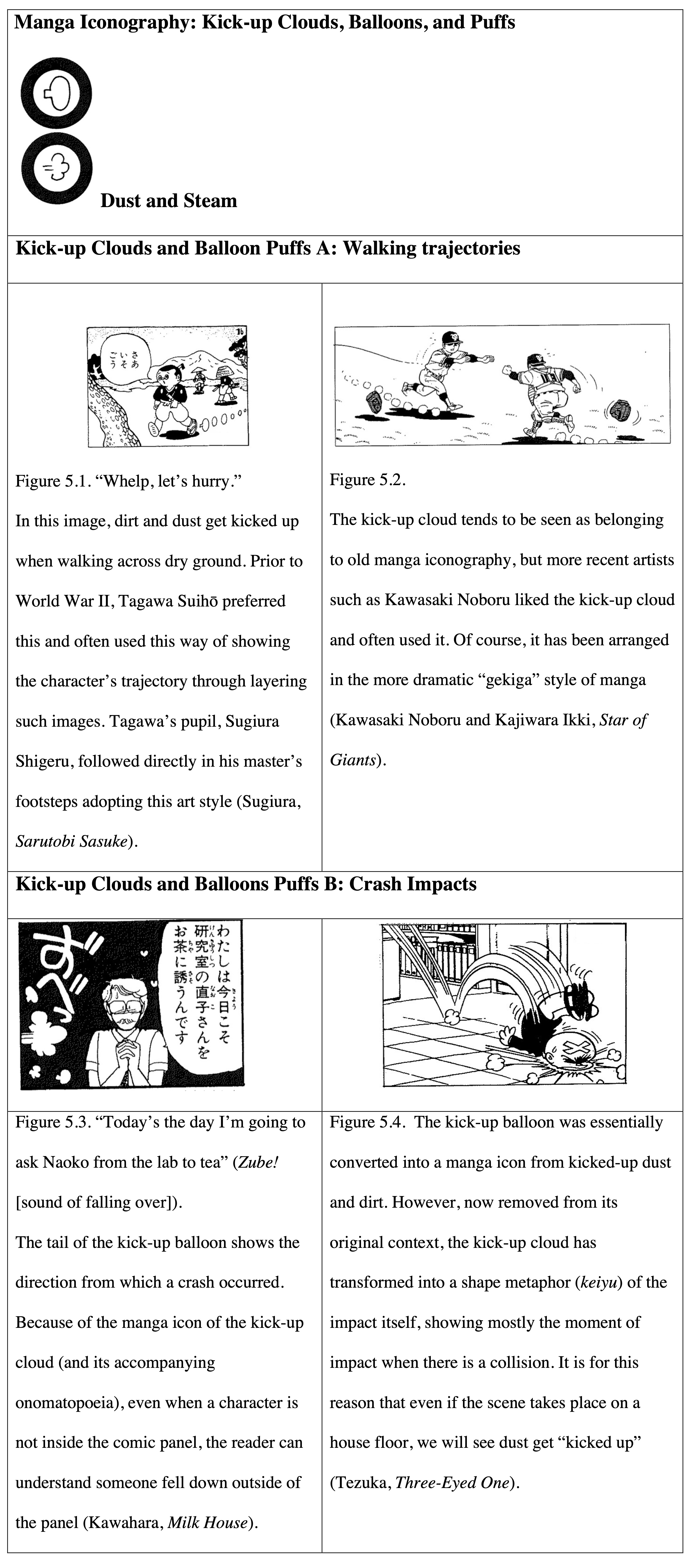
Burnt Smoke Is the Image of Burning Food and Failing
The icon of burnt smoke symbolises the black smoke that is produced when something is scorched. Characterised as a drawing done with a single brush stroke in one messy line, this icon can manage to cover the entire background. In that case, perhaps we should not analyse it as a manga icon, but rather as an effect.
In manga, the use of the burnt smoke icon originated from times such as characters burning food when cooking as in Figure 6.1. Of course, while this is no more than actual burnt smoke, I would like to draw the reader’s attention to the image of “failure” that is also produced here at the same time. In general, smoke that has been burnt black not only represents a spreading fire, but is also deeply intertwined with images of losing something valuable to fire. In cases when burnt smoke is used iconically for psychological effect, it manifests the feeling of something valuable being lost or the feeling of one’s expectations being dashed. In other words, these scorch marks connote “disillusionment” (Figures 6.2 and 6.3).
How the Physical Symbol for Light Changed into a Psychological Icon
The star sign is quite renowned. There are several variations of the star symbol, from stars with five points (i.e., a pentagram) to stars in the shape of a simple cross. However, artists do not just use those star symbols to mean stars in the night sky. For example, they will use this manga icon to show the sparkle of a precious gem (reflected light), as well as for the sparks that occur when stone or metal violently collide against each other.
Of course, the star sign not only has these physical nuances, but also artists will use them to show something psychological. For example, in Figure 7.4, we see points of light that show a sense of nobility and mystery. The artist employs this starry image that itself has a sense of mystery, making one think of the glitter of precious gems. The star sign can also be used to express an extreme psychological shock (Figure 7.11). The artist uses the image of a spark to do this. Previously, I discussed focus lines (shūchūsen), which of course are a shape metaphor (an effect) that also express light, but we can probably say that these “points of light” are a more heightened state of this than when visualised with focus lines.
A Representative Manga Icon that Functions Even Independently from Its Original Context
The manga icon of veins symbolises when one experiences deep anger or excitement, during which blood rushes to the head and results in veins coming to the surface. These types of veins are also called “blue veins” (ao-suji) or “veins bulging out from anger” (kanshaku-suji). A crossroads shape, just like the Iron Cross of the former German military, is the orthodox shape, and it symbolises two crossing veins, as seen in Figure 8.1. This does not mean that actual veins have this type of shape. Rather, this shape is very unique to manga and is quite humorous, hence veins are used rather frequently in silly scenes while they are not preferred for serious stories.
A unique feature of veins is that they purely represent the character’s “anger” and are drawn on places such as hair where actual veins can never appear (Figure 8.2) or on inanimate objects (Figure 8.3). Due to its clear meaning (there is no room for any other interpretation other than “anger”) and its high degree of independence as a symbol, one can say that veins are a good example of a shape metaphor detached from its original context (in this case, from real veins).
X Marks Mean “Injury” and Patches Mean “Poor”
When a simple X-mark is drawn on a person’s face or body, it represents an injury in terms of its iconography (Figure 9.1). Though actual injuries would never take the shape of simple X marks, the marks can also mean things like “no good”, “torn up”, and “damaged”, so the meaning of “injury” is likely adapted from those meanings. There is also a variation of the X mark used to represent band-aids (Figure 9.2).
Perhaps things like the manga icons for patches on clothes can also be explained as a variation of the X mark, taking into account the above uses. (Consider how one side of a patch on clothing looks like a series of many X marks strung together.) During a period of time in Japan when resources were lacking, people would patch old clothes to make them last longer, which then made patches a symbol of and also synonymous with being poor. Because of this, the manga icon for patches also contains meanings such as “poor”, “insecure”, and “uncool.” For example, the patch on the girl’s kimono (Figure 10.1) is not an actual patch. Instead, it is symbolic, implying her insecurity.
Why “Shape Metaphors” Are Not Called “Symbols”
By the way, how did we, the authors of this book, decide to use the term keiyu (“shape metaphor”) and how is it different from the word kigō (“symbol”), which is commonly used? Let’s try to make the definition clearer. According to Sanseidō’s dictionary Kōjirin, symbols (kigō) are things that “have the function of indicating certain content and circumstances in accordance with a set of rules.” Following that, “shape metaphors” then are no different than symbols, which indicate things like movement and inner thoughts in manga “in accordance with a set of rules.” That is, these two words are, meaning-wise, almost the same. Then why did we, in How to Read Manga, invent the word, “shape metaphor” (keiyu)? It is because actual manga expressions entail a variety of different levels of symbols layered on top of each other in a complicated way. It would be dangerous to bundle them all together under the same word of “symbol” (kigō).
Let us take for example things like the trademark three hairs on top of Oba Q’s head and the whirlpool-like pattern on Bakabon’s cheeks that could also be understood as symbols.[20] However, it is impossible to treat those symbolic marks in the same way as the kind of symbols that we have previously discussed, such as “veins” and “focus lines.” Basically, Oba Q’s three hairs are a marking that only establish the “base” of that character’s identity; they are not things that change according to his situation or state. In that sense, we should only interpret them as a part of the “illustration” of Oba Q.
Bakabon, by comparison, has markings that do change depending upon the character’s situation, so they will do things like appear and disappear. These symbol types have the function to adapt to things like the characters’ movement and psychology; they are the ones that we in particular term “shape metaphors” (keiyu). As manga illustrations are fundamentally collections of symbols, it will become confusing if we are not strict in making this distinction.
Certainly, shape metaphors are not just symbols unique to manga. As you can see on this page, shape metaphors also actively utilise symbols from other fields, such as punctuation marks and musical notes (here, I have categorised them within our manga iconography). Manga is like a giant snake that swallows every possible symbol and sign in its path.
End of Part I
An Illustrated Guide to Manga Effect
Movement or Shadow?: It Depends on the Subject in the Picture
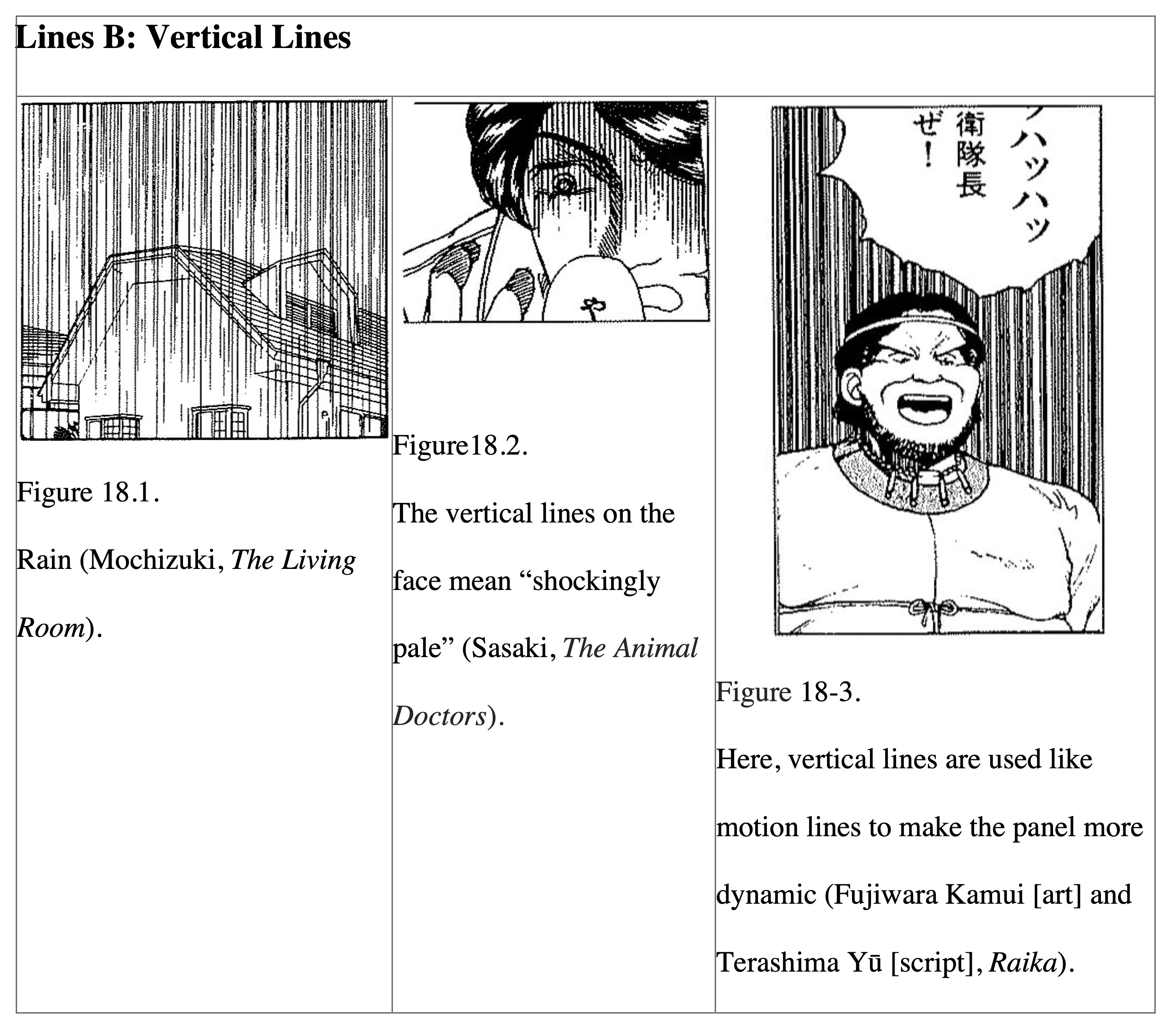
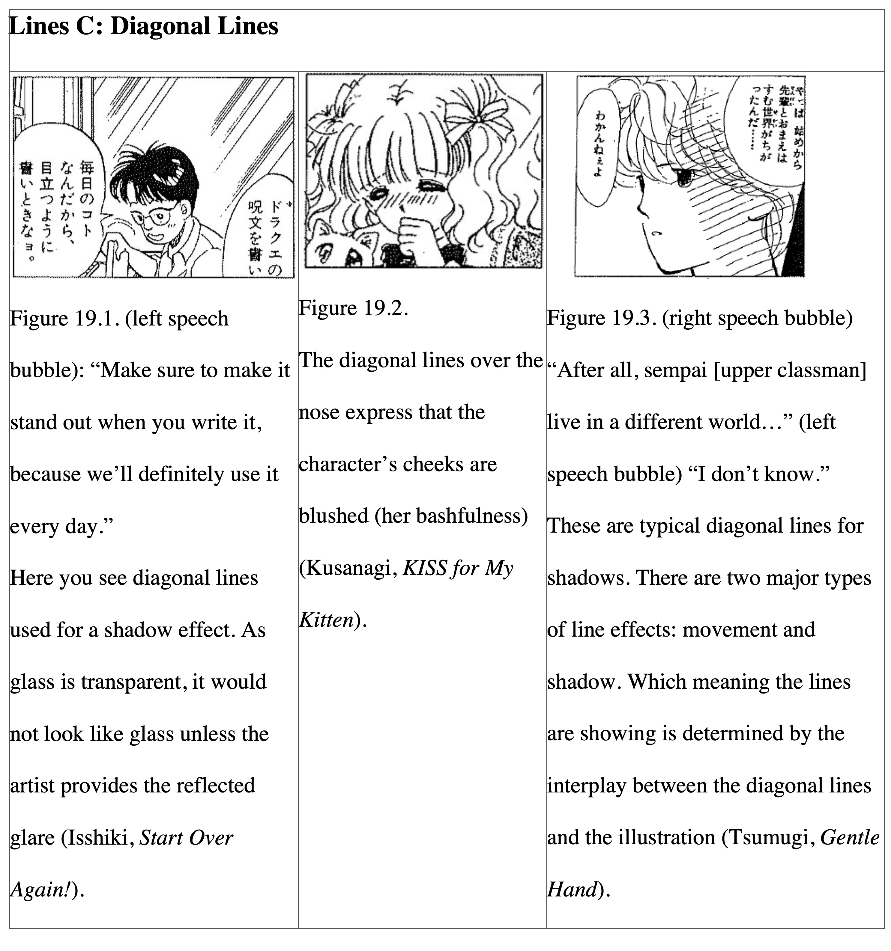
The type of shape metaphors introduced here are ones that have no specific shape nor meaning (by themselves) so I am categorising them as “effects” (kōka). The most important characteristic of “effect” is that they make sense only when they are drawn in as part of the overall illustration. For example, parallel lines are nothing more than mere lines if there is no illustrated context for them. However, when they accompany a flying ball (Figure 17.1) or flow through the background of a running car (Figure 17.2), then those lines become effects that signify the subject’s movement. The lines are a visualisation of air flow and the lines themselves are often called “motion lines” or “speed lines.”
On the other hand, the parallel lines drawn in the background for Figure 17.3 are an expression of the shadowy background, indicating that the panel is dark instead of it showing any movement. With few exceptions, these lines are literal effects serving to make the subject stand out through its movement, its shading, or its background.
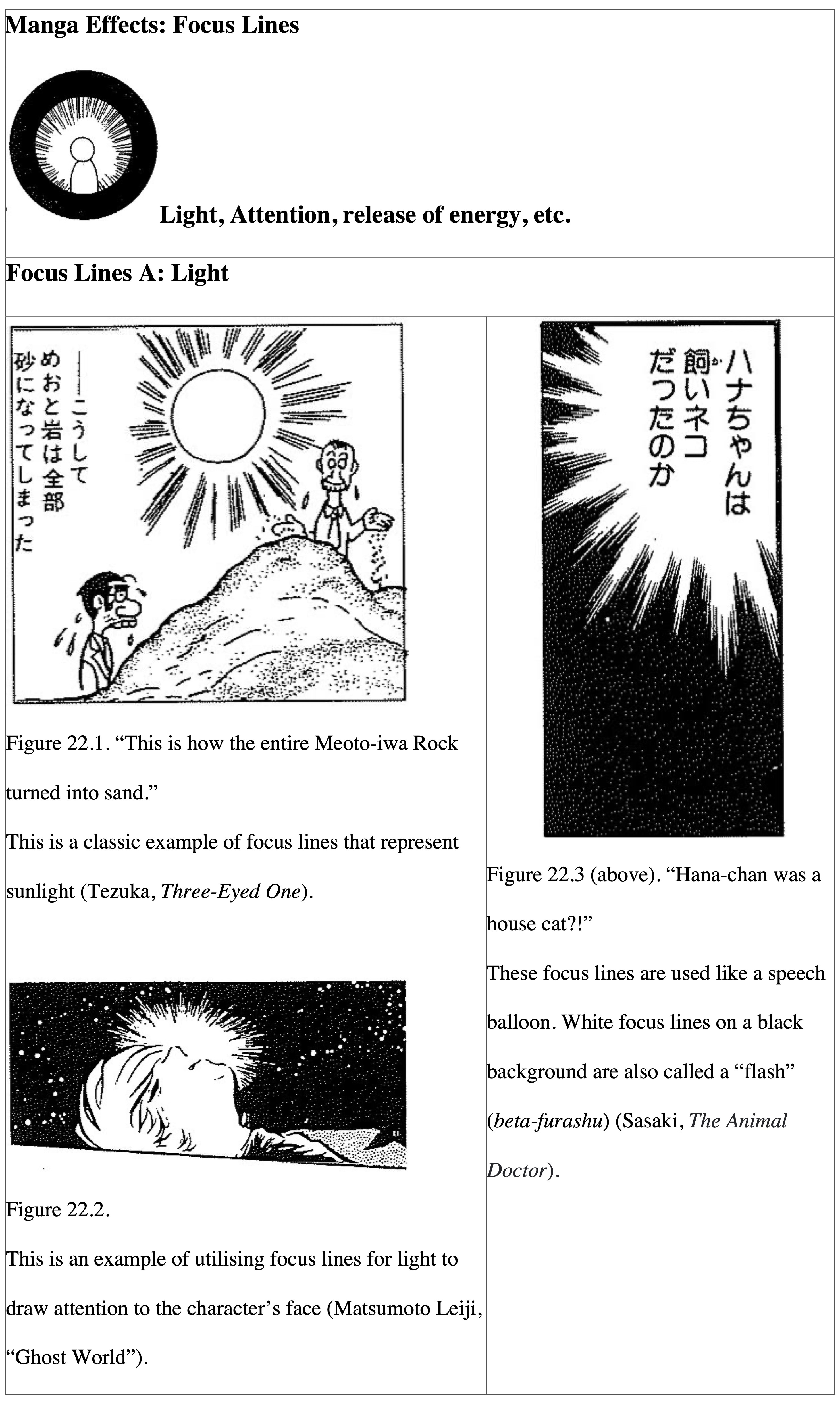
The Function of Focus Lines is to Draw One’s Attention to a Point
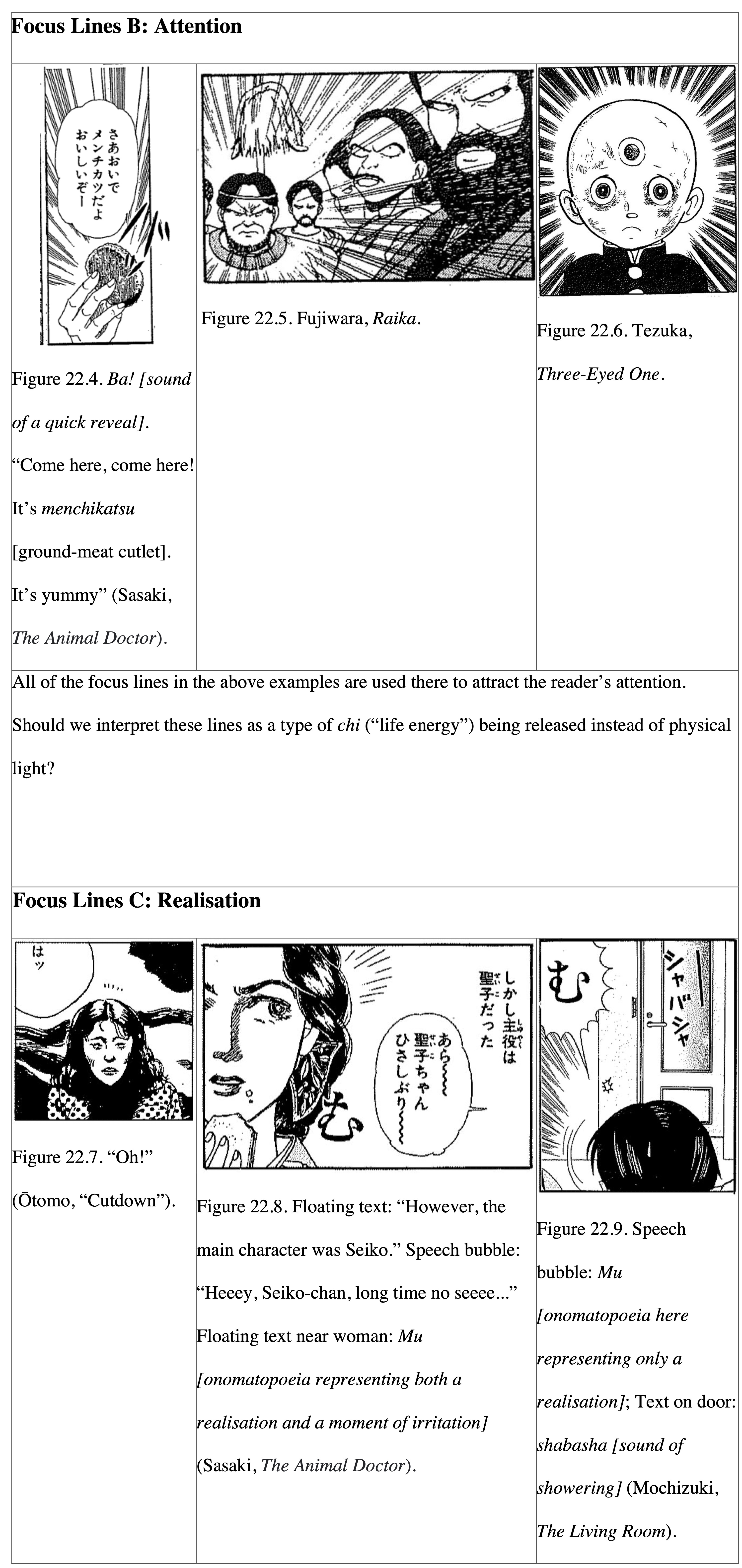
Focus lines have the function of showing the release of energy (such as light and/or sound) from a certain point. Originally, the form of focus lines was most likely based on symbols for sunbeams (Figure 22.1[21]). Perhaps it is more appropriate to call them “burst lines” instead because they show emissions of energy. However, if you think about it, when something like intense light or sound is released, one’s gaze focuses on that point. In manga, there is no better effect than focus lines to attract the reader’s attention to a point. Even if focus lines come out of something mundane, like a menchikatsu (“ground-meat cutlet”), as long as the author’s intent was to get the reader’s attention focused on that point, then this is the correct thing to do in manga (Figure 22.4).
Focus lines that radiate subtly from the head of a character are quite interesting (Figure 22.7). These are called “realisation lines” or “inspiration lines” and, as the name implies, these lines show the way a character’s consciousness is directed towards another object. This is because consciousness is also considered a type of energy.
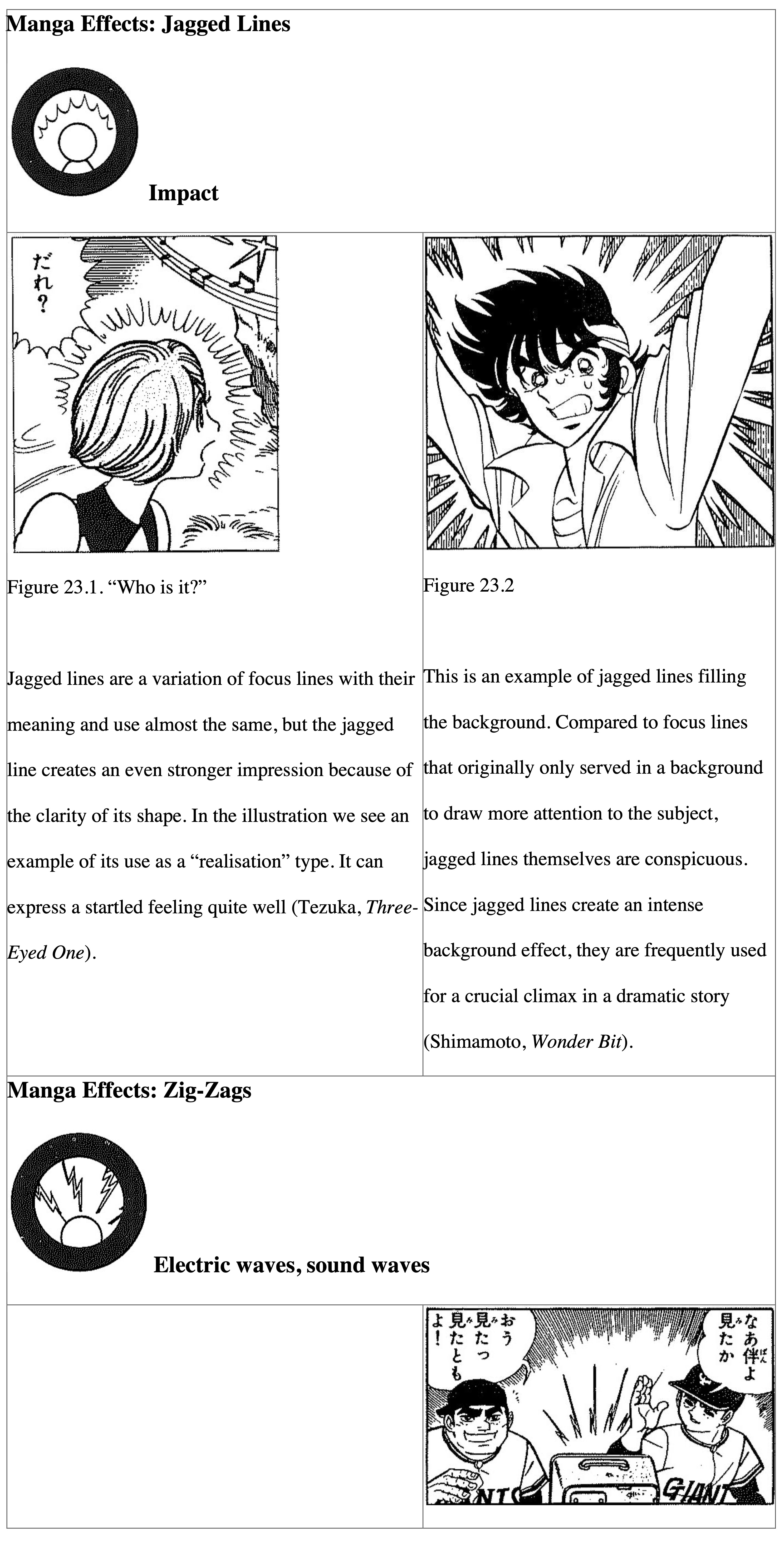
Jagged Lines for Impact and Zig-zags for Broadcast Waves
Jagged or spiky lines (giza-giza) are akin to focus lines; they create an effect that shows the buildup and release of energy. When a small, jagged line is attached to the space around the subject as in Figure 23.1, it represents things like “realisation” and “inspiration” just as we saw previously in Figure 22.7. However, this jagged line type has a stronger effect than those others due to the clarity of the line. In general, a jagged line is a shape metaphor for an “impact” effect. Figure 23.2 offers another example of jagged lines that cover the entire background in order to enhance an intense shock effect.
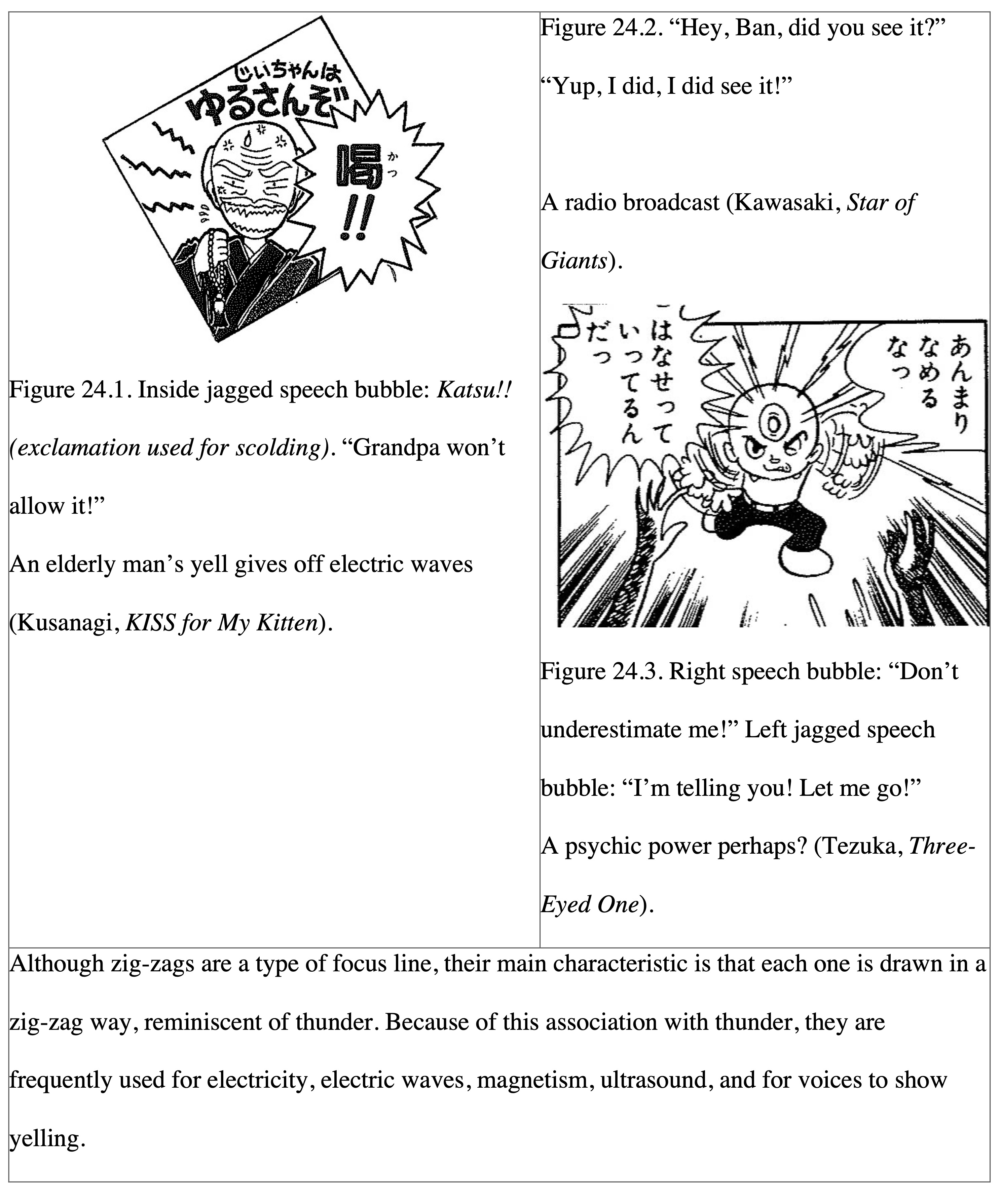
Next, zig-zag lines were originally a shape metaphor meant to represent things like electricity, magnetism, and electric waves. (One could say that the zig-zag line might be a manga icon due to the high specificity for those meanings.) Occasionally, zig-zags are used for sound waves. Even in these cases, it is likely to represent a sound that has undergone electric processing, such as for a broadcast. Similarly, zig-zag lines can be used to indicate the voice when an old man yells, probably because of its strong association in Japanese with the phrase “dropping thunder” (kaminari o otosu), which means “to scold severely.”
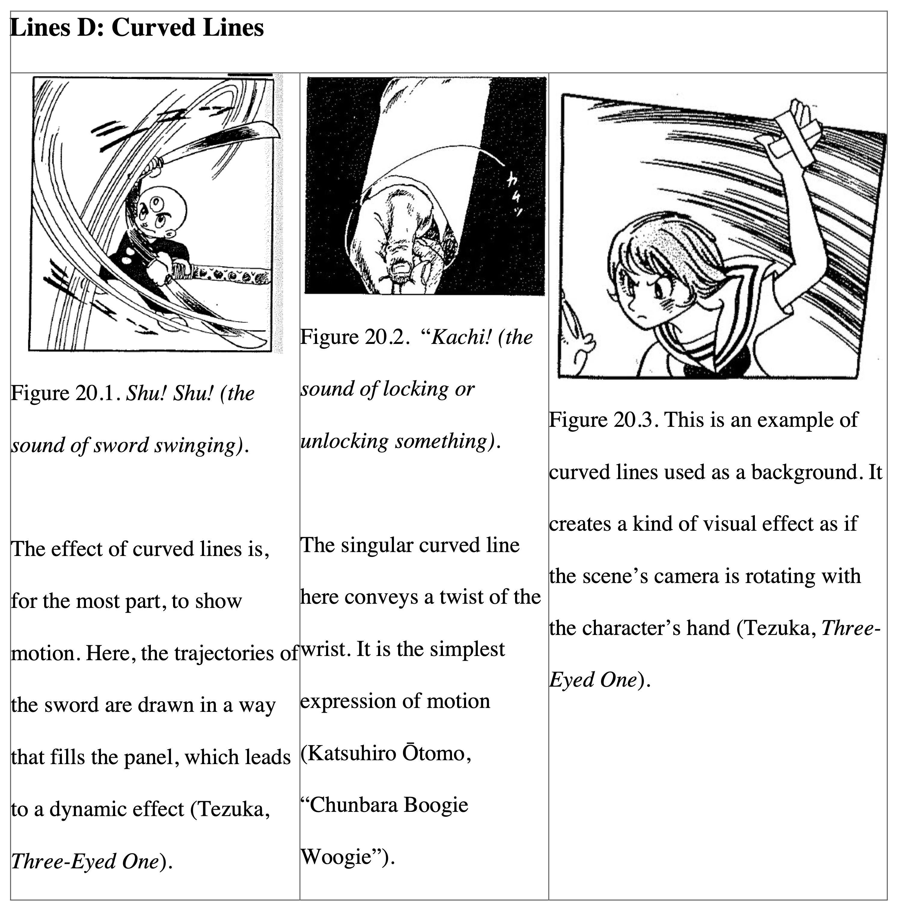
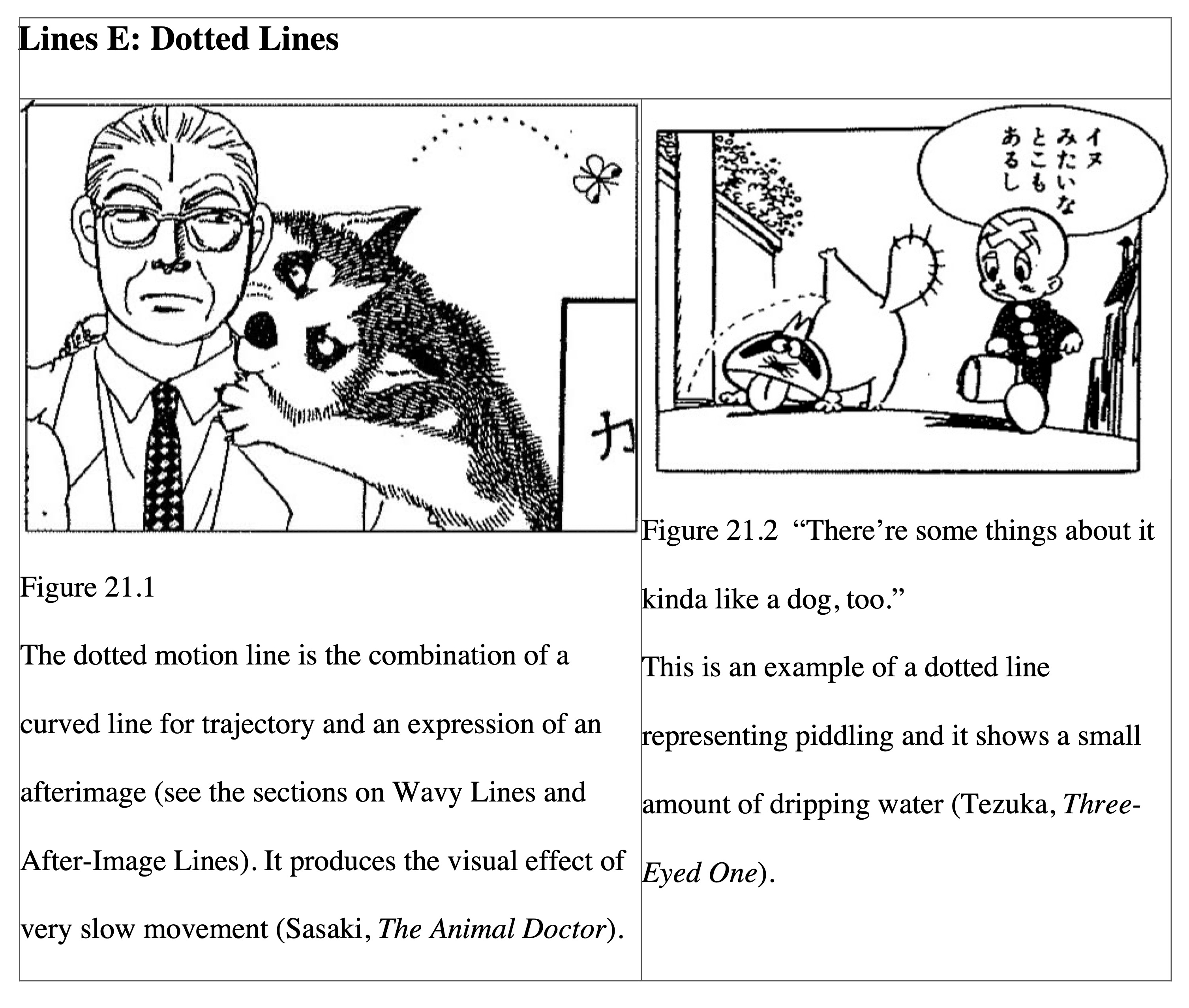
Wavy Lines and After-Image Lines Represent Unstable Motions
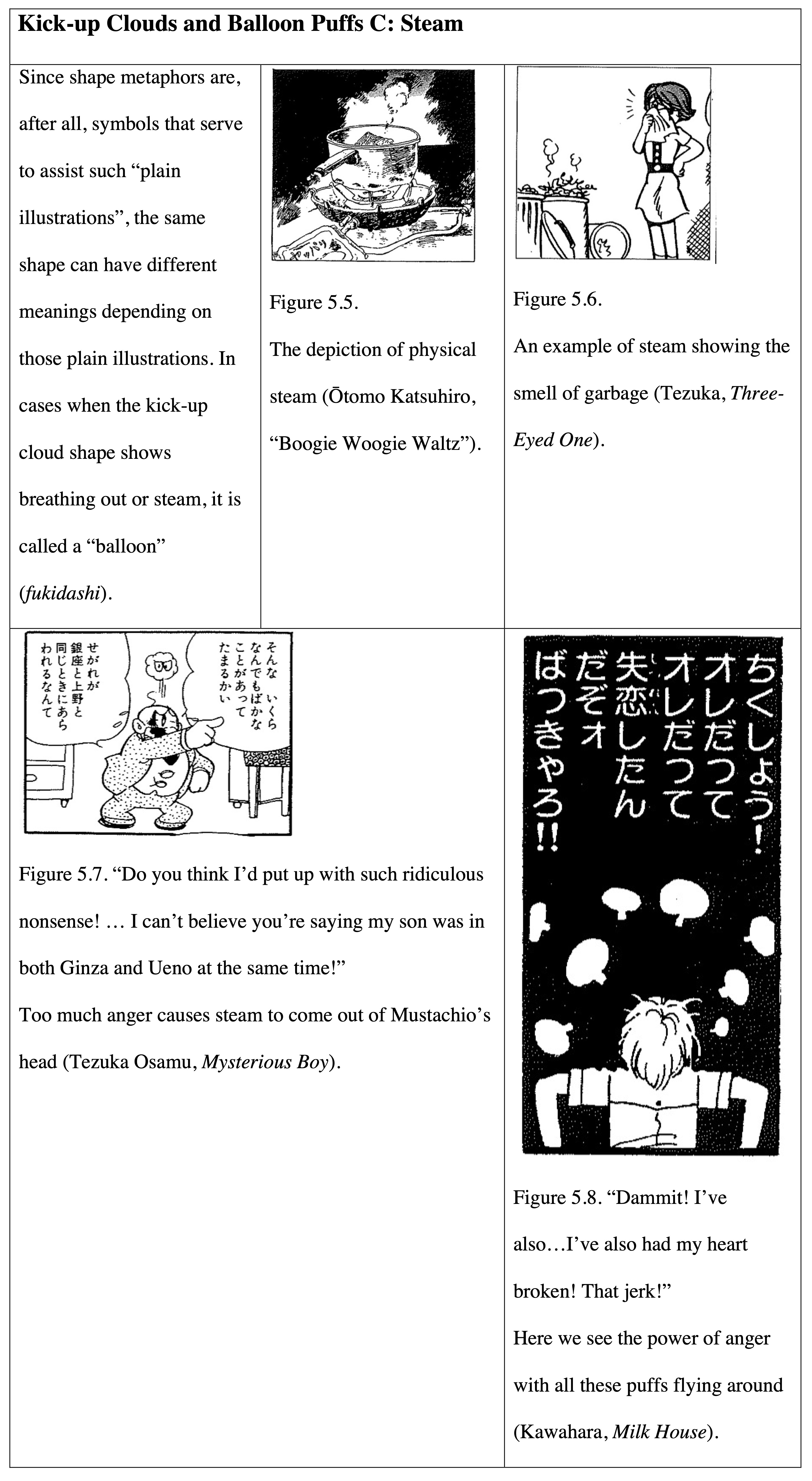
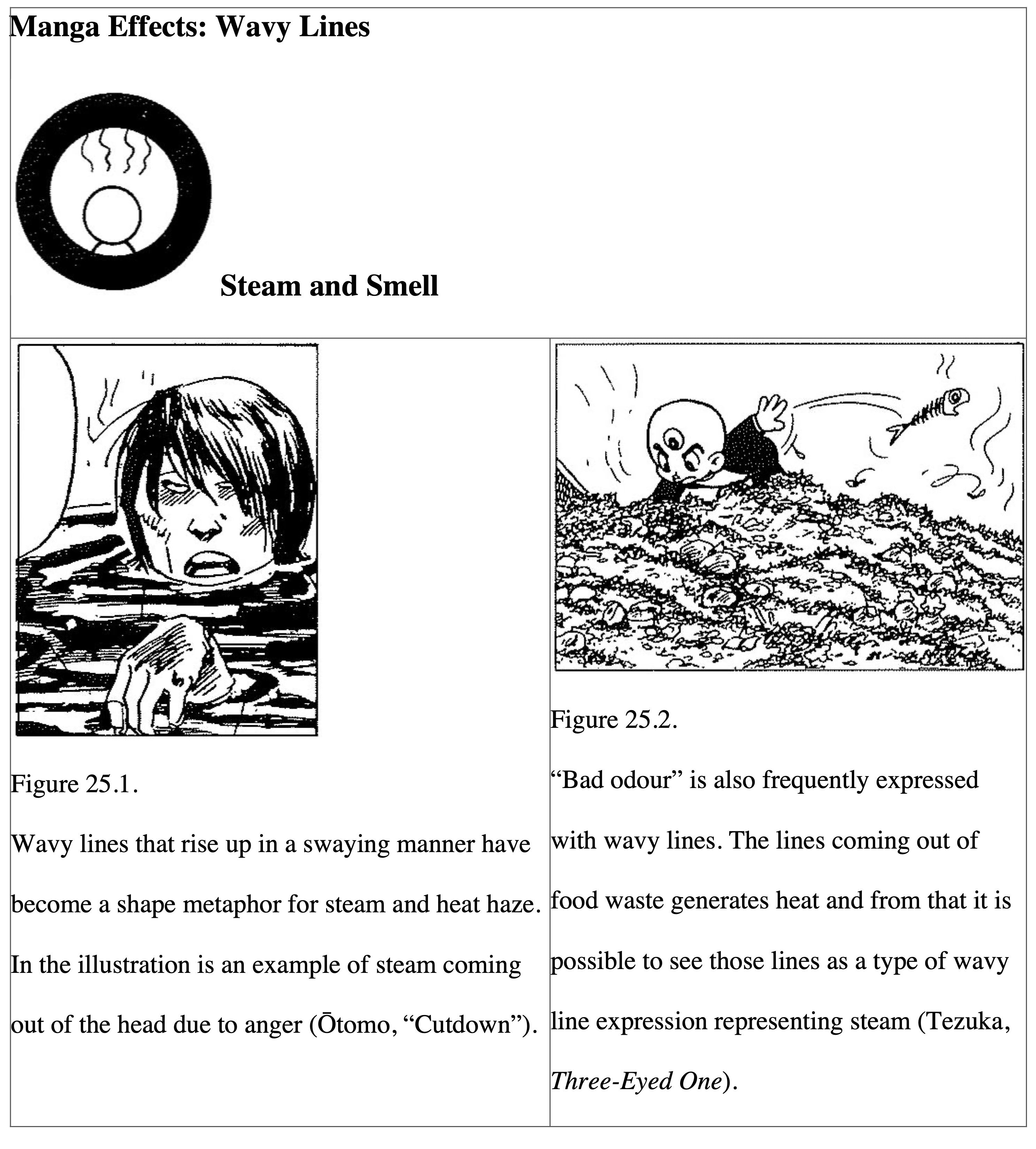
As the central three lines of the map symbol for a hot spring (♨) indicate, parallel wavy lines are a shape metaphor that indicate the rise of steam. There also seem to be many cases where “smell” and the like are expressed with wavy lines. Steam and smell, both gases, are phenomena that occur at some degree of high temperature, which is probably why they both take the same shape metaphor. Wavy lines can be interpreted as a type of motion line; even though they are invisible, steam and smell create a back-and-forth movement effect in the air. In fact, wavy lines are frequently used as motion lines for the movement of extremely light objects.
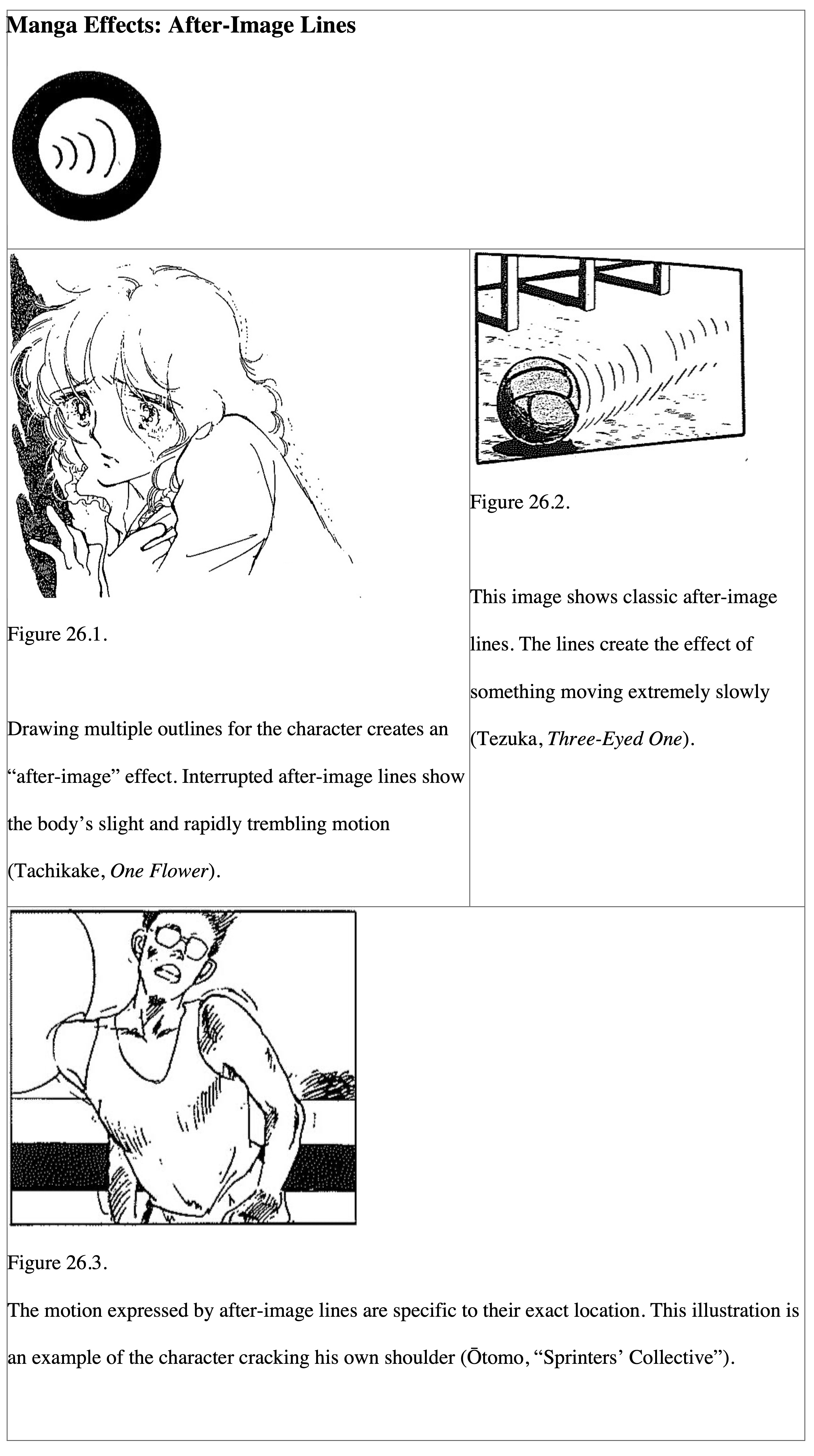
After-image lines are also a type of motion line. However, they are different from straight lines and curved lines in that the artist expresses motion by drawing small segments of line (i.e., the after-image) around parts of the outline of a moving object. This way of drawing kills the sensation of speed, and it makes it appear as though something is moving extremely slowly (Figure 26.2), or like something is vibrating in place (Figure 26.1). The latter is sometimes specifically called “trembling” (furue).
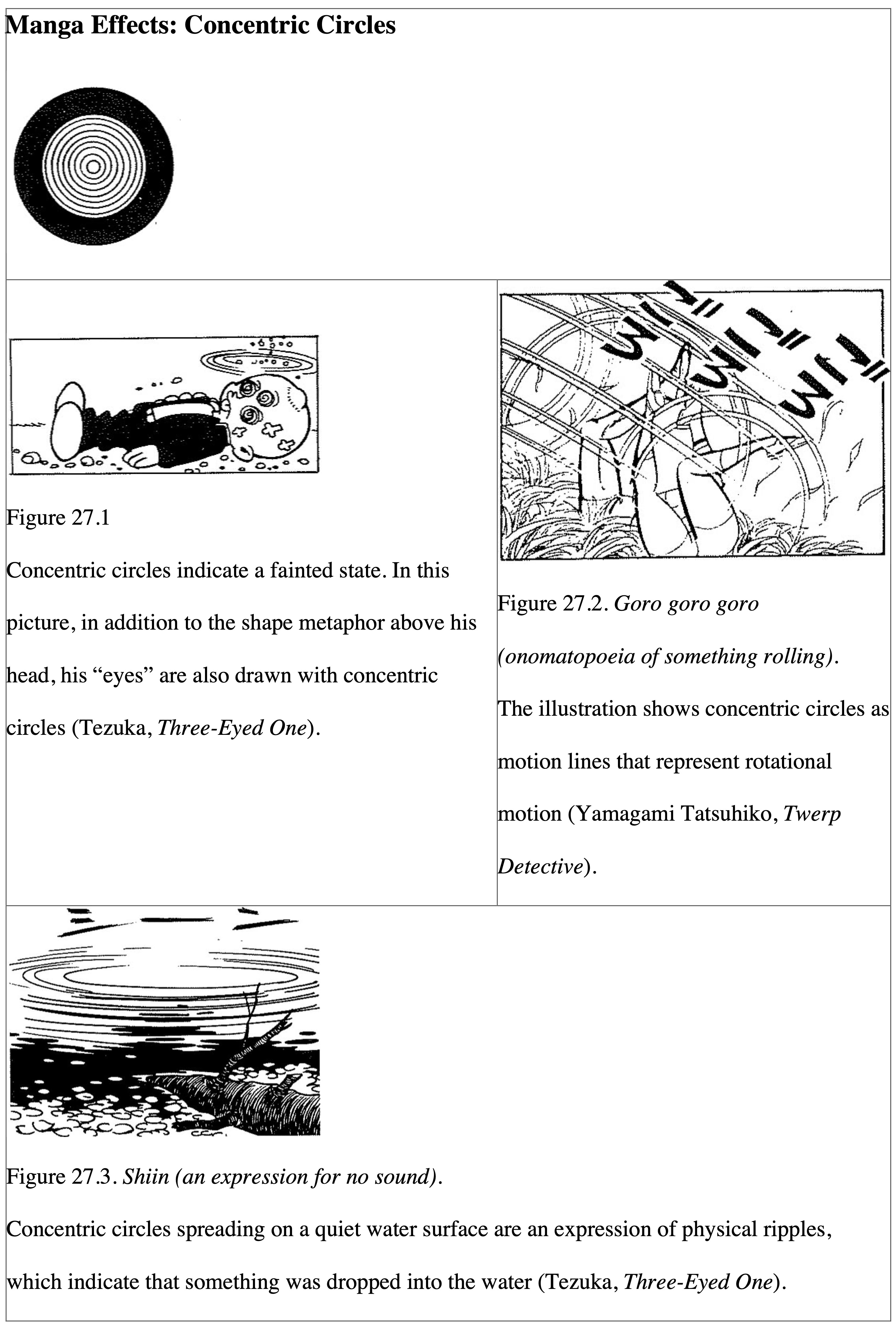
Concentric Circles and Spirals Indicate “Dizziness”
Concentric circles are a shape metaphor that represent “rotation” of an object or “diffusion” of energy. The concentric circles in Figure 27.1 are the type that mean rotation, but exactly which parts are the ones rotating? In other words, they are a metaphor for “the eyes are rotating” (i.e., “a person fainted”). That is because when people experience a vertigo attack, it appears as if the surrounding scenery is spinning; hence, when artists objectively draw that state, they use concentric circles like this. In Figure 27.2, concentric circles are used as motion lines simply to represent physical rotation. In Figure 27.3, the meaning is not like the rotation kind. Instead, we have an example of concentric circles representing ripples across the water surface (diffusion).
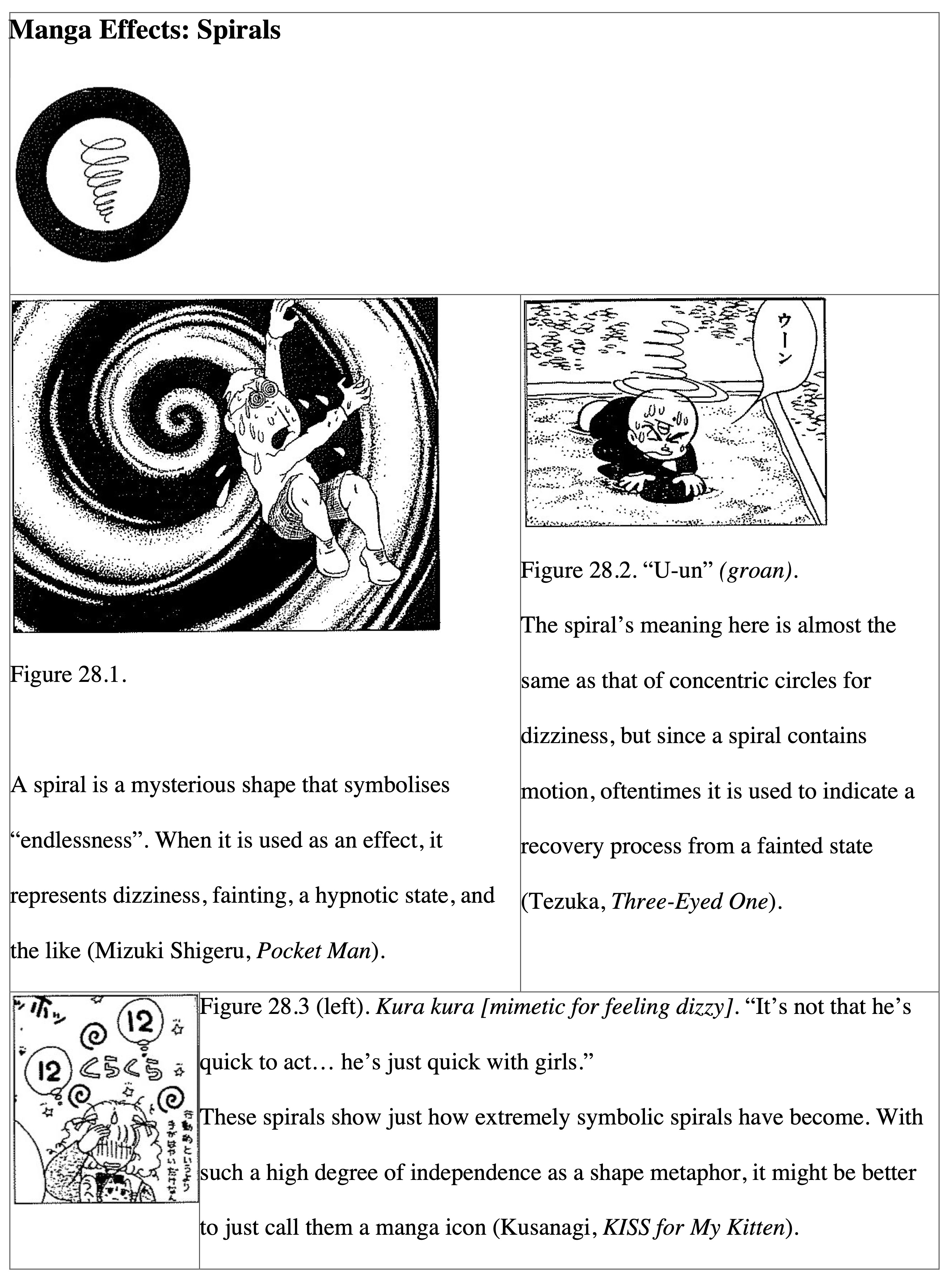
Spirals are a shape metaphor also often used for “dizziness”. While spirals seem similar to concentric circles, the difference is that spirals are drawn with a single line. This induces an anxious feeling as if the reader is being dragged into endless darkness (Figure 28.1). This is most likely because lines indicate a certain direction and that creates the perspective of motion and moving toward an infinite vanishing point.
Cross Hatching for Shading and Roping for Emphasising Anxiety
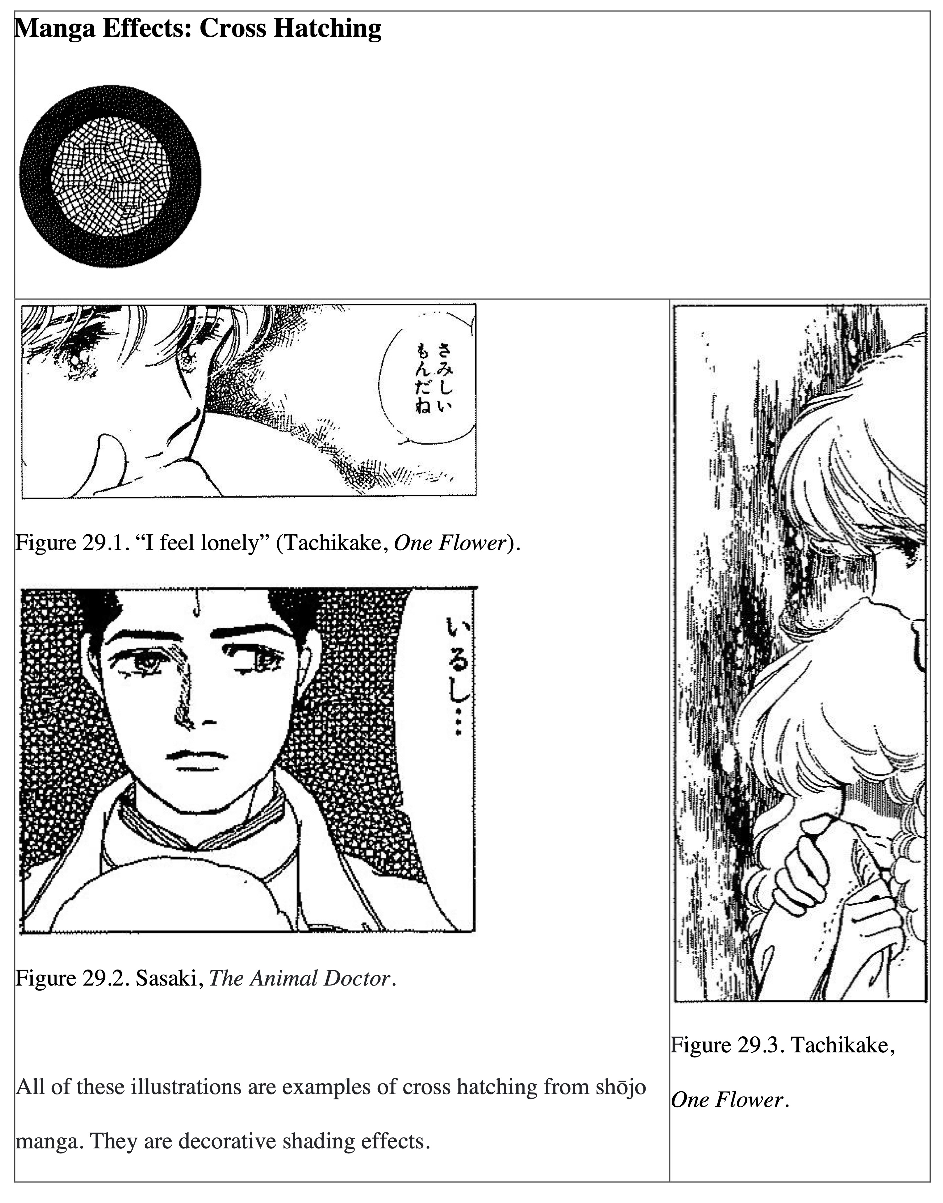
Both cross hatching and roping are effects created by taking a couple of short parallel lines as a unit and crossing (multiplying) many of them in different directions. Although cross hatching and roping are effect types to generate shading, they are drawn according to such well-established rules that the result is they produce an extremely decorative impression. Cross hatches and dots (below, next section) were used in place of screen tone before it existed. Of course, in those times the artist could choose to request the platemaker (the one who printed the comic) to engrave the light shading; however, artists preferred drawing their own cross hatching because they could judge the result of the work for themselves rather than leaving it to the platemaker. Even today, cross hatching is frequently used in shōjo manga, which greatly values decorativeness.
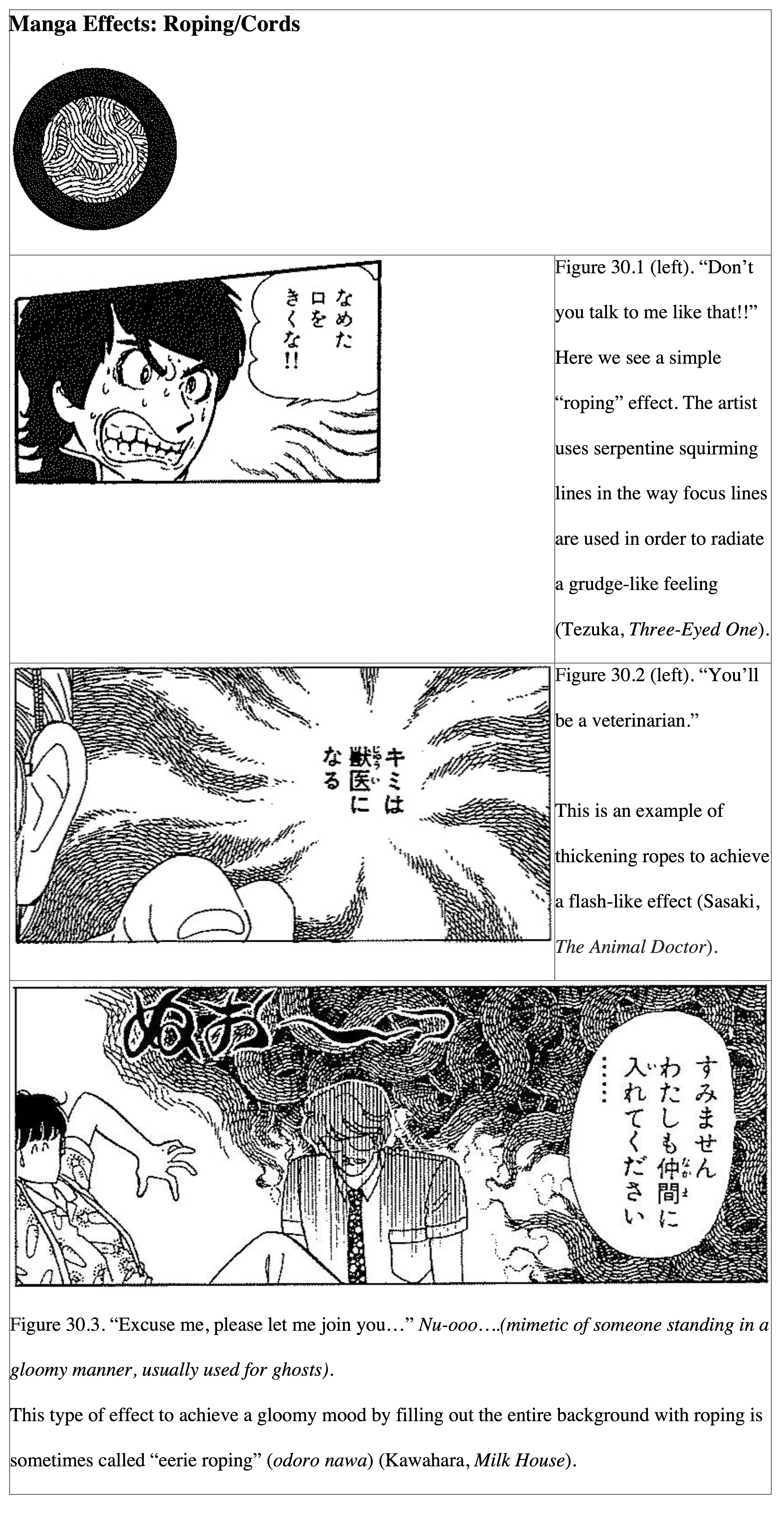
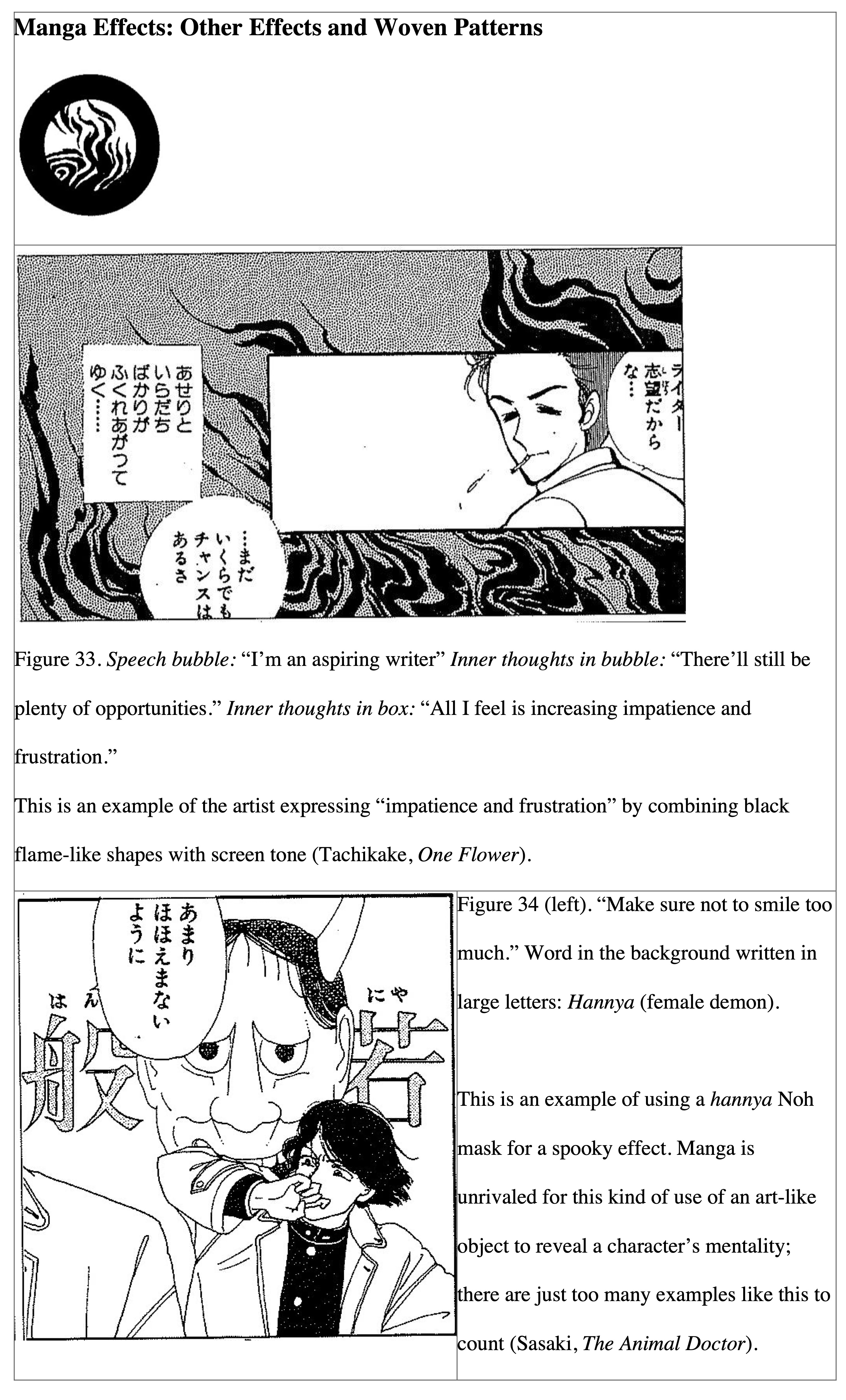
Roping is also a type of cross hatching, but the name “roping” (nawa) derives from the fact that roping is used more like lines rather than focusing on the surface pattern. When a unit of parallel lines are intermittently connected along the same direction, a serpentine pattern appears like snakes roaming around the screen. They create a heavy and gloomy mood for the entire scene.
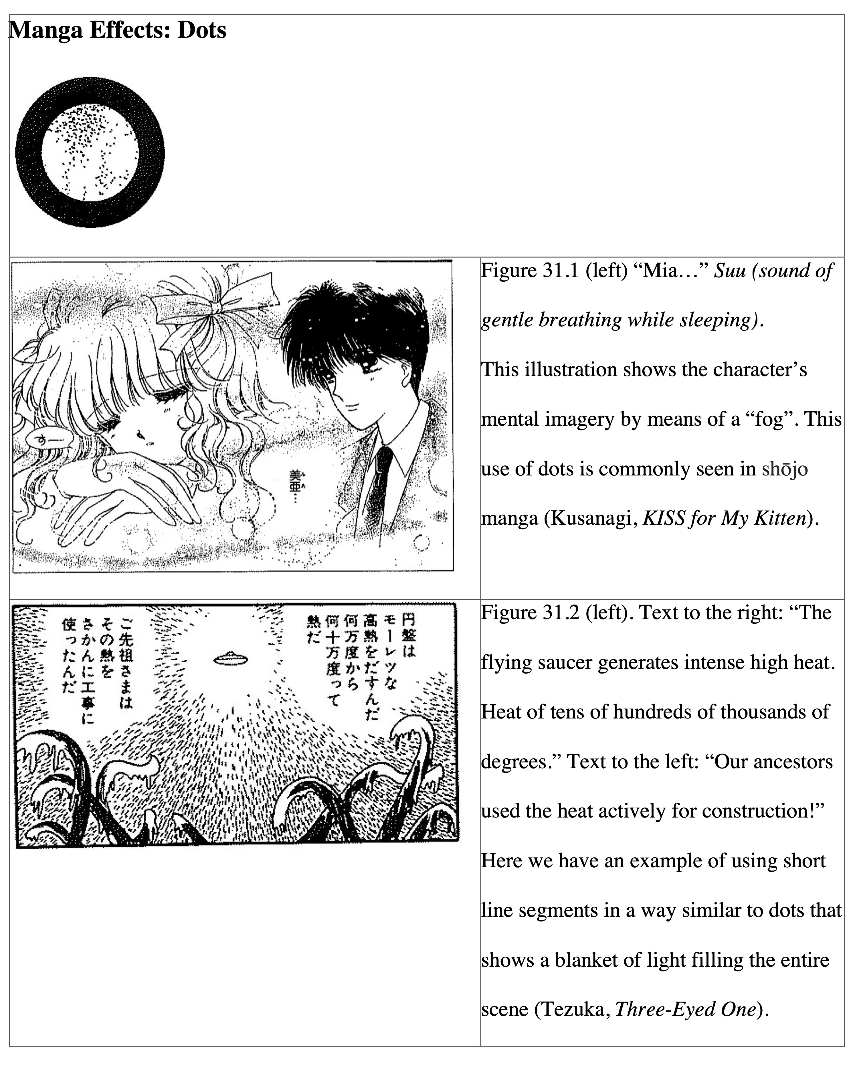
“Shōjo Manga Flowers” Only Exist in One’s Imagination
Dots are also commonly used for things like backgrounds in manga. Dots are originally a shape metaphor for fine particles such as dust, fog, and sand, but sometimes artists will use dots to fill in the entire background. Mizuki Shigeru likes to do this. Whether they are used for the entire background or not, since dots are not lines, artists can use them in their manga to create a mystical effect quite unlike illustrations rendered mainly in lines. Even though screen tone is a type of dot expression, it cannot produce the complex and delicate effect that dots invoke.
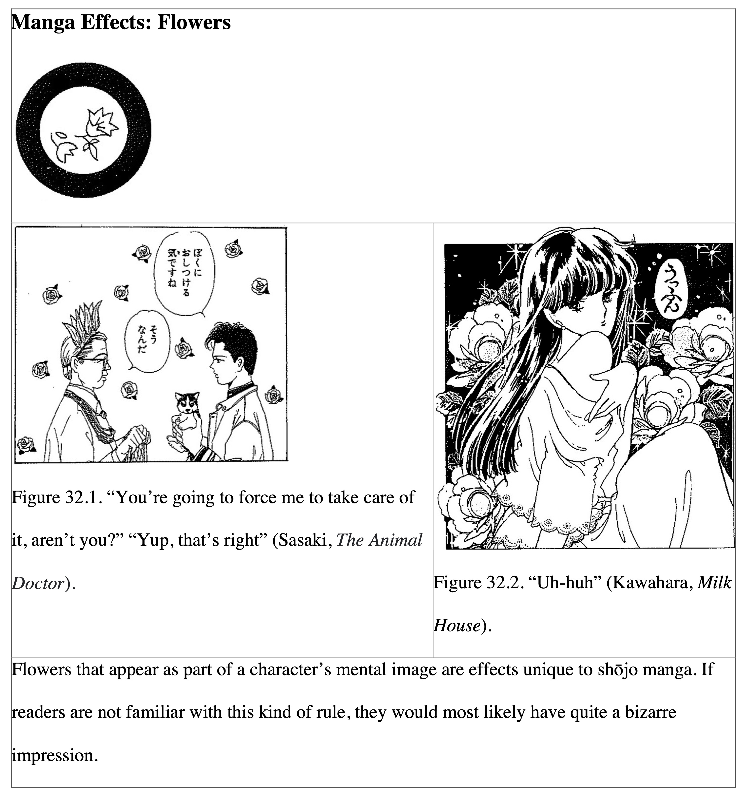
For our next topic, there might be some objections to the inclusion of “background flowers,” the kind of which are often seen in shōjo manga as shape metaphors. However, these flowers are never real flowers; they are imaginary entities drawn only to emphasise the glamorousness of a scene. In Figure 32.1, the artist creates background flowers that are almost like wallpaper. Sasaki Rinko is a shōjo manga artist who is critical of standard shōjo manga patterns, so it is likely that she intentionally avoided drawing over-the-top background flowers. Of course, even without explanation, you can see that Figure 32.2 shows the excessive expression of flowers normally found in classic shōjo manga.
Woven Patterns Are Variations of the Inner World
Lastly, I will introduce here a collection of woven patterns that are used in backgrounds. Of course, the ones shown here are just a few examples. Those effects and woven patterns are all shape metaphors frequently used to specifically represent a shift in the subject’s psychological state or feeling. They are all either shapes that do not exist in reality, or, even if they do exist, how they are used is not realistic. Nonetheless, those expressions of shape metaphors make it possible for us clearly to process the character’s psychological state and the mood of the story.
Shape metaphors as an effect are roughly divided into two types: ones that represent the subject’s behaviour or physical state (such as motion lines and focus lines); and, ones that represent the subject’s psychological state (such as cross hatching and woven patterns). It is interesting that more variations of the latter are found in shōjo manga. What this means is that the essence of shōjo manga is its psychological drama, which puts a spotlight on the protagonist’s inner thoughts.
Notes
1 Viz has published an English translation of only the first of the series’ three volumes: Takekuma Kentarō and Aihara Kōji, Even a Monkey Can Draw Manga, trans. Yuji Oniki (San Francisco, CA: Viz, 2002).
2 Takekuma Kentarō, “Hitome de wakaru ‘keiyu’ zukan,” in Manga no yomikata, ed. by Takekuma Kentarō, Natsume Fusanosuke, et al (Tokyo: Takarajimasha, 1995), 78-105.
3 Readers of this journal can read of their first impressions of McCloud through Natsume’s twin translated essays in Natsume Fusanosuke, “Natsume Fusanosuke on Scott McCloud’s Understanding Comics,” INKS 6.3 (Fall 2022): 365-373.
4 John E. Ingulsrud and Kate Allen, Reading Japan Cool: Patterns of Manga Literacy and Discourse (Lanham, MD: Lexington Books, 2009), 51-52.
5 Ingulsrud and Allen, Reading Japan Cool, 7.
6 For recently translated essays by Japanese authors on onomatopoeia, see Yomota Inuhiko, “The Problems of Onomatopoeia in Manga,” translated by Jon Holt and Karen Curtin, Multimodal Communication, 11:2 (June 2022), 75-91; Natsume Fusanosuke, “The Power of Onomatopoeia in Manga,” translated by Jon Holt and Teppei Fukuda, Japanese Language and Literature, 56:1 (April 2022), 157-184; see also Mia Lewis, “Rumble, Race, and Crash: Space and Movement through Sound Effects in Akira and American Flagg!” Mechademia 13.2 (Spring 2021), 139-168.
7 Lukas R.A. Wilde, “Material Conditions and Semiotic Affordances: Natsume Fusanosuke’s Many Fascinations with the Lines of Manga,” Mechademia 12.2 (Spring 2020), 62-82.
8 Eike Exner, Comics and the Origins of Manga: A Revisionist History (New Brunswick, NJ: Rutgers University Press, 2021), 33.
9 Exner, Comics and the Origins of Manga, 92.
10 Neil Cohn, The Visual Language of Comics: Introduction to the Structure and Cognition of Sequential Images (London: Bloomsbury, 2013), 157.
11 Cohn, The Visual Language of Comics, 158; for a comparator text to the present essay, see Kazuko Shinohara and Yoshihara Matsunaka, “Pictorial Metaphors of Emotion in Japanese Comics,” in Multimodal Metaphor, edited by Charles J. Forceville and Eduardo Urios-Aparisi (New York, NY: Mouton de Gruyter, 2009), 265-291.
12 Cohn, The Visual Language of Comics, 198.
13 Edward T. Hall, Beyond culture. (New York, NY: Doubleday, 1976); Hall, “Context and meaning” in Intercultural communication: A reader, 9th ed. by L. A. Samovar & R. E. Porter (Belmont, CA: Wadsworth Publishing, 2000), 34–43.
14 Takekuma and Aihara, Even a Monkey, 19.
15 Cohn, The Visual Language of Comics, 59 and 160-162.
16 [Translators’ Note] Names are given in the traditional Japanese order of surname first. For titles with Japanese loan words from English, they follow the English spelling rather than the Japanese katakana spelling (Big Comic Spirits instead of Biggu Komikku Supirittsu).
17 [Translators’ Note] Takekuma first used this expression in his co-authored (with Aihara Kōji) Even a Monkey Can Draw Manga: Manga Classroom (Saru de mo manga egakeru kyōshitsu), which was serialized in Big Comics Spirits from 1989 to 1991; the episodes were collected and published in their first hardcover volume in 1990 by Shōgakukan during serialisation. A classic of early manga studies, it is affectionately known by its abbreviated title “Saru-man.”
18 Some of the included illustrations have been trimmed in order to make it clearer and easier for the reader to see the point.
19 [Translators’ Note] In his discussion of Sarutobi Sasuke (from Figure 5.1), Holmberg writes of “the prolific use of briffits (dust clouds expressing fast walking or running) and the distinct sauntering style… which are among the many formal traits from Tagawa’s work that Sugiura continued using,” thus situating this kind of manga icon to the 1930s but continuing on through the 1950s. See Holmberg’s translation of Ninja Sarutobi Sasuke, (New York Review Comics, 2023).
20 [Translators’ Note] Akatsuka Fujio’s Tensai Bakabon (Genius Idiot) and the artist duo Fujiko Fujio’s Obake no Q-tarō (“Oba-Q” for short) are so famous and beloved in Japan, that Takekuma need not describe them for his original audience. For more information on Oba-Q, see Frederik L. Schodt’s short chapter on Fujiko Fujio’s joint career in manga in his Dreamland Japan: Writings on Modern Manga (Stone Bridge Press, 1996), pp. 212-220. Similarly, Schodt’s short note on Akatsuka Fujio’s Tensai Bakabon in Manga! Manga! The World of Japanese Comics (Kōdansha, 1983) is helpful for the uninitiated. These gag-manga artists and their works are woefully under-researched in English.
21 [Translators’ Note] This is a famous rock in Japan that looks like a married couple.
Manga Bibliography
Note: Titles in the figures that were translated into English appear here in the bibliography with their original Japanese and serialised magazine publication (or original print publication data). Modern editions of the following manga may no longer be available. Where possible, we have added mention of those recent editions and/or recent translations of said work into English. If a story is no longer in print, we listed the original serialised dates and venue, following Takekuma’s practice.
Chiba Tetsuya. The Harris Wind (Harisu no kaze, originally serialised in Weekly Shōnen Magazine [1965-1967]).
Fujiwara Kamui and Terashima Yū. Raika: Chronicles of Japan (originally serialised in Comic Burger, 1987).
Isshiki Makoto. Start Over Again! (Denaoshitoide!, originally serialised in Big Comic Spirits [1987-1989]).
Kawahara Yumiko. Addressed to Milk House (Zenryaku Miruku Hausu, originally serialised in Special Issue Shōjo Comic [1983-1986]).
Kawasaki Noboru and Kajiwara Ikki. The Star of the Giants (Kyojin no hoshi, originally serialised in Weekly Shōnen Magazine [1966-1971]).
Kusanagi Ryūju. A ♡ KISS for My Kitten (Koneko ni KISS ♡, originally serialised Puchikko magazine [1993]).
Matsumoto Leiji. “Ghost World” (”Yūrei Sekai,” originally published in COM [1969]).
Mizuki Shigeru. Pocket Man (Poketto man, originally serialised in Weekly Shōnen King [1978]). Republished in Mizuki Shigeru. Mizuki Shigeru manga taizenshū 59: Poketto man, hoka (Kōdansha, 2014).
Mochizuki Minetarō. The Living Room (Ocha no ma, originally serialised in Young Magazine [1989] and Mister Magazine [1991-1992]).
Ōtomo Katsuhiro. “Boogie Woogie Waltz” (originally published in Weekly Manga Action [1974]). Republished in Ōtomo Katsuhiro. Ōtomo The Complete Works 2: Boogie Woogie Waltz (Kōdansha, 2022).
------. “Chunbara Boogie Woogie Chunbara Boogie (“Chunbara bugi-ugi chunbara bugi,” originally printed in Weekly Manga Action [1975]). Republished in Ōtomo Katsuhiro. Ōtomo The Complete Works 2: Boogie Woogie Waltz (Kōdansha, 2022).
------. “Cutdown in the Street” (“Tsujigiri,” originally published in Manga Action Special Issue [1975]). Republished in Ōtomo Katsuhiro. Ōtomo The Complete Works 2: Boogie Woogie Waltz (Kōdansha, 2022).
------. “A Dark Night’s Passing” (“Anya Kōro,” originally published in Weekly Manga Action [1974]). Republished in Ōtomo Katsuhiro. Ōtomo The Complete Works 2: Boogie Woogie Waltz (Kōdansha, 2022).
------. “Double Suicide, Autumn 1974” (“Shinjū ’74 Aki,” originally published in Weekly Manga Action [1975]). Republished in Ōtomo Katsuhiro. Ōtomo The Complete Works 2: Boogie Woogie Waltz (Kōdansha, 2022).
------. “ELECTRIC BIRD LAND” (originally published in SF Adventure [1980]).
------. “Pakku, at the End of the Day that Wasn’t Even Fucking Funny” (“Pakku, kuso-omoshiroku mo nakatta kyō no owari ni,” originally published in Weekly Manga Action [1974]). Republished in Ōtomo Katsuhiro. Ōtomo The Complete Works 2: Boogie Woogie Waltz (Kōdansha, 2022).
------. “The Sprinters’ Collective” (“Tankyorisōsya no rentai,” originally published in Weekly Manga Action [1975]). Republished in Ōtomo Katsuhiro. Ōtomo The Complete Works 2: Boogie Woogie Waltz (Kōdansha, 2022).
Sasaki Noriko. The Animal Doctor (Dōbutsu no oisha-san, originally serialised in Hana to Yume [1988-1993]).
Shimamoto Kazuhiko. Wonder Bit (originally serialised in Loguin [1990-1991]).
Sugiura Shigeru. Sarutobi Sasuke (Omoshiro Manga Bunko [1953]). Republished in English as Ninja Sarutobi Sasuke, translated by Ryan Holmberg [New York Review Comics, 2023]).
Tachikake Hideko. One Flower for You (Hitotsu no hana mo kimi ni, originally serialised in Ribbon [1984]).
———, Mysterious Boy (Fushigi na shōnen, originally serialised in Shōnen Kurabu [1961-1962]).
———, Magic Mansion (Mahō yashiki [Fuji Shobō, 1948]).
———, Metropolis (Ikuei Publishing [1949]). Republished in English as Metropolis, translated by Kumar Sivasubramanian [Dark Horse Comics, 2003]).
Tezuka Osamu. The Three-Eyed One (Mittsume ga tōru, originally serialised in Weekly Shōnen Magazine [1974-78]).
Tsumugi Taku. To Have a Gentle Hand (Yasashii te o, motteru, originally serialised in Special Issue Margaret [1984]).
Yamagami Tatsuhiko. Twerp Detective (Gakideka, originally serialised in Weekly Shōnen Champion [1974-1980]).
Article and Translation copyright Karen Curtin and Satomi Newsom
The electronic journal of contemporary japanese studies was founded on 9 January 2001.
Page created 16 December 2019, last modified 16 December 2019.
Email the webmaster if you have any problems.
Copyright electronic journal of contemporary japanese studies.
